
Art to match your favorite football team (without the tackiness)
If you are a die hard fan but still want to live in a space that doesn’t give off serious teenager-bedroom energy, add art that makes the space classy, not tacky.
Patriots + Jen Pack
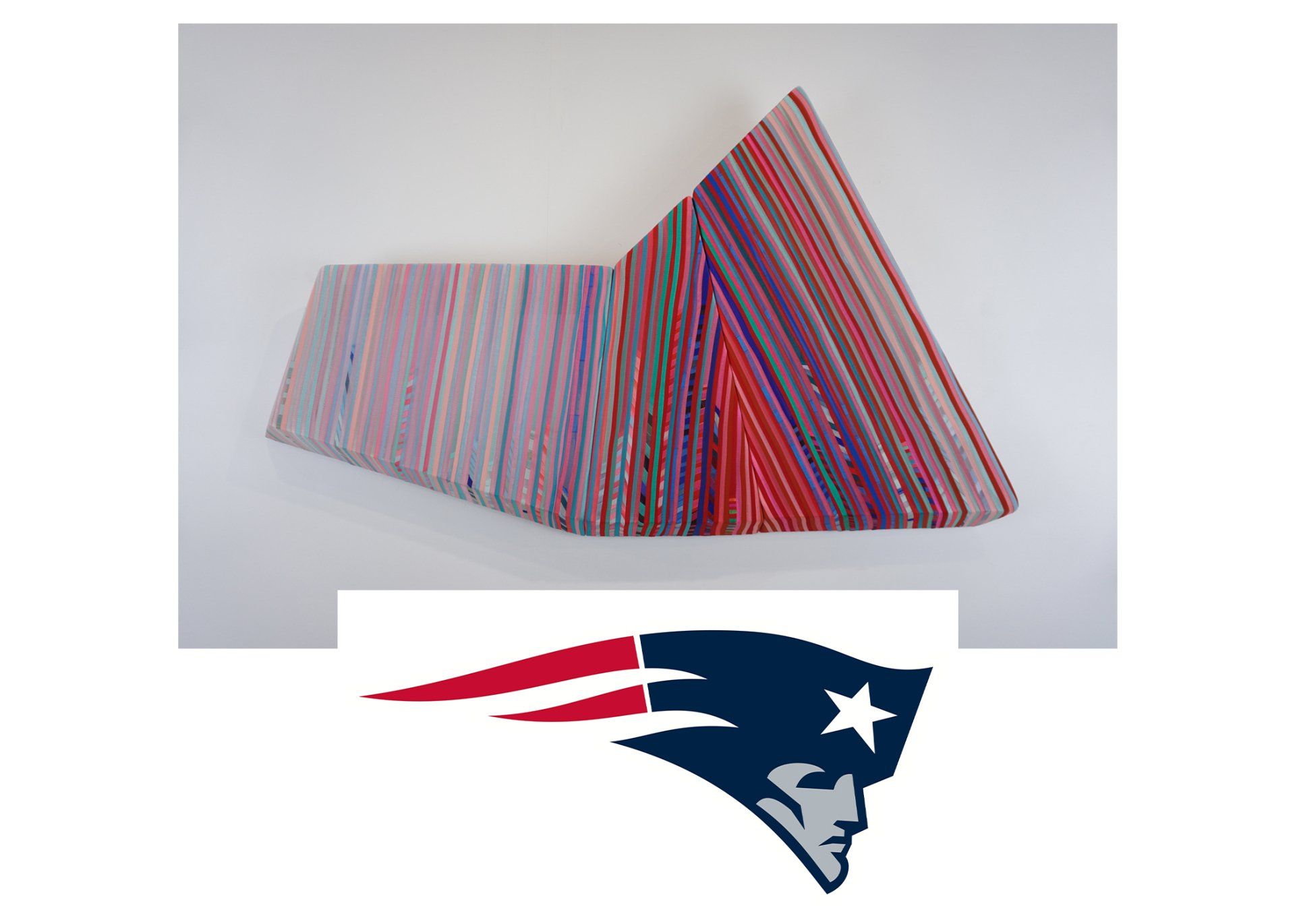
Cleaving to an Essential Wound by Jen Packhas to be one of my favorite pieces at the moment and it fits beautifully in with not only the colors, being that is primarily red and blue, but also with the overall shape of the logo. The logo for The Patriots has a forward slanting sort of movement to it as does Jens piece which has similar movement to one another.
Steelers + Stephanie Henderson
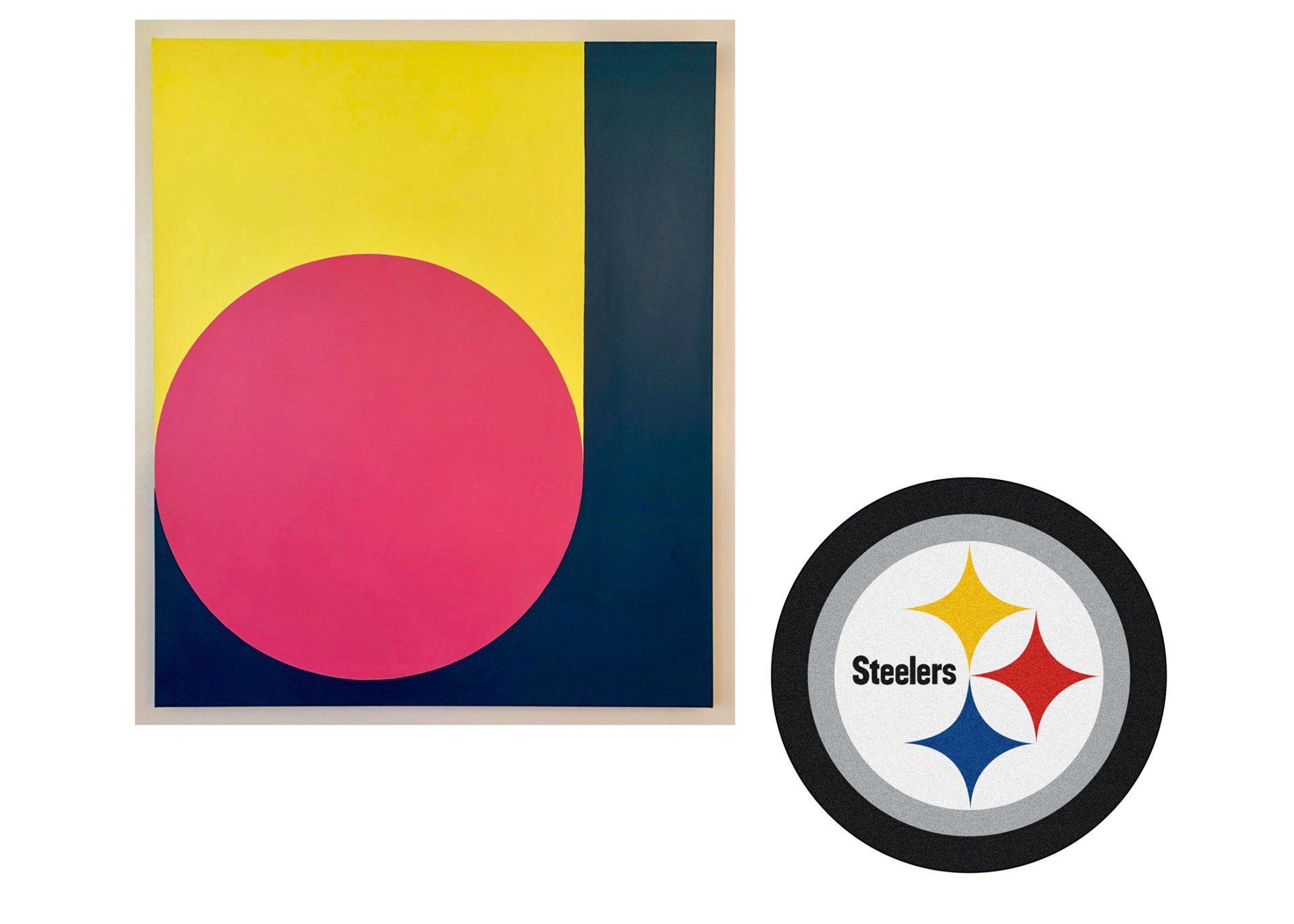
Steelers are another team that is relatively easy to find art that goes along with the general color scheme of the team. Scoop in Lemon by Stephanie Henderson is a beautiful example of the primary colors tweaked a little to make a little more visually interesting. Stephanie's piece has those colors arranged in a beautifully abstract display. Her pieces are always conversation pieces but having your team's colors, rather subtly, hanging from the wall will make her work all the more show stopping.
Rams + Rebecca Stern
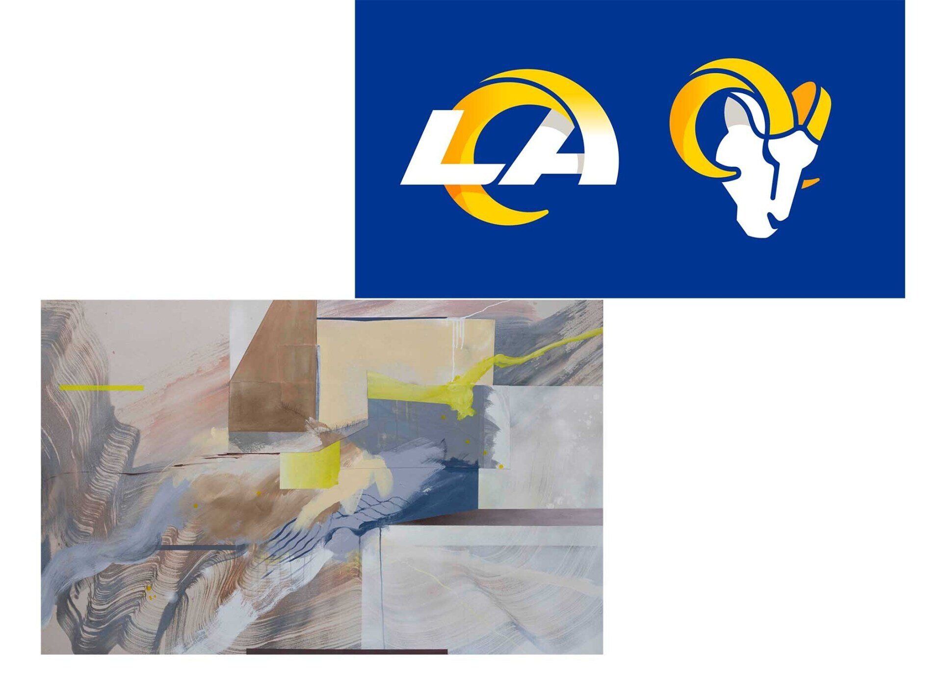
Rebecca Stern has such a beautiful blue and yellow piece that is just the perfect shade of golden yellow and royal blue to go along with the colors of the LA Rams. It is called Unraveling and is one of my favorite pieces of the moment. It is a calm neutral piece with little pops of both vibrant yellow and cool blue making it really versatile all the time. Let alone when the Rams are playing!
Dolphins + Jaime McCarrier
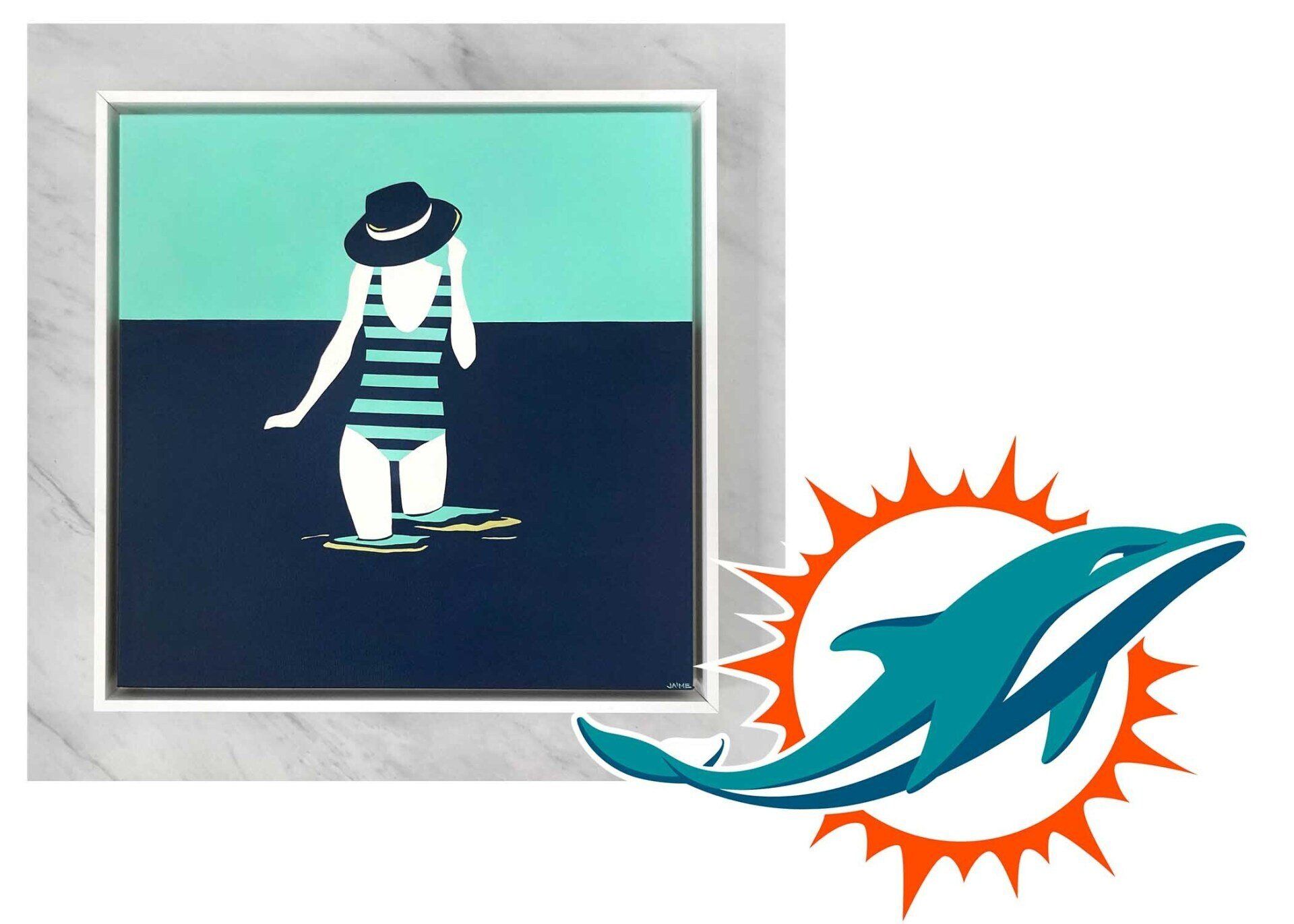
Jaime McCarrier’s
Horizon
slips right into half the color palette of the Dolphins, while giving the beachy feel because, well, they’re dolphins. The navy in the piece ties in the navy from the underbelly of the dolphin in the logo, and the teal brings in the color from the body. A good way to add in the pop of orange would be placing sunflowers throughout the room; the late bloomers are great for the late summer/early fall anyway. Even after the game is over and the guests are gone, sunflowers brighten up the space to make it feel happy and cheery.
All of this being said, these are pieces we already have. A lot of our artists work with us to make customworks for art lovers that fit their color palette perfectly. We could even include a little of everyone’s favorite. I know at my sister's house she would have to include both the red and gold of the chiefs and Iowa state and the black and gold of the University of Iowa, which could be a really sweet way of coming together in spite of not being fans of the same team.