
Anatomy of an Artwork
Art isn’t a single choice—it’s a series of choices. Use these tips to better understand what you’re drawn to, what makes you pause, and what doesn’t resonate the next time you encounter art.
The anatomy of artwork helps you learn what you do and don’t like. Most people decide how they feel about a piece of art almost instantly. Studies suggest that the average viewer spends about fifteen seconds looking at a piece of art (as a gallery owner who is around this all the time, it feels closer to ten seconds). Often times, they glance, they form an opinion or reaction, and they move on. There’s nothing wrong with approaching art in that form, because art is emotional and intuitive. But when it comes to purchasing art, collecting, or even just understanding your personal taste. Learning the anatomy of artwork allows you to intuitively direct a piece, slow down, look deeper, and articulate why something might (or might not) resonate with you.
When I’m out and about looking at artwork, I take a mental note of this checklist that helps observe pieces... especially if I’m not responding well to one in particular. Instead of dismissing the piece completely and moving on, I try to break it down into its components/elements. This process helps me see the artwork, not just as one whole, but as the sum of many intentional choices. More often than not, going through this checklist helps me notice something I didn’t notice the first time. Sometimes it doesn’t change my overall opinion, but it opens up a new appreciation for what the artist has created. This checklist focuses on the elements of an artwork and the principles of its design.
Elements of a Work of Art:
The elements of art are the basic visual building blocks. Every artwork, regardless of style or medium, is made up of these components
- Line - creates any shape, texture, or movement. As the artist Paul Klee once said, “A line is a dot that went for a walk"
- Shape - encloses areas using lines or color. Shapes can be geometric or organic. Can be representative of an object or abstract.
- Form - three dimensional effect created by lines, shape, and color.
- Color - hue of lines, shapes, and forms. Color also refers to the value (lightness or darkness, and intensity).
- Value - encompasses the use of light and dark, which create depth, contrast, and shadow.
- Texture - surface quality or feeling. It can be tactile, such as a rough texture created in paint or stone, or implied through visual cues.
- Space - arranges all of the above elements into composition. Space can create depth, balance, and proportion.
When you look at a piece and feel unsure about it, ask yourself:
Which of these elements stands out? Which feels unresolved or particularly strong?
Geometric Abstract
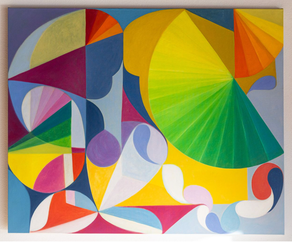
Line - composed of clean, precise lines that define the geometric shapes. The curved and diagonal lines intersect, which add movemeent and guide the eye across the composition.
Shape - combination of triangles, circles, and rectangles, emphasizing a structured composition. The balance between angular and curved shapes creates contrast and harmony.
Color - vivid, warm palette of yellows, oranges, and reds is complemented by cool blues and purples.
Texture - smooth, even application of oil and acrylic paint, which creates a flat texture.
Space - overlapping shapes and strategic placement of color creates a sense of depth and layering.
Value - light and dark tones are used to create contrast and dimension.
Form - created on a canvas and is two-dimensional
Realistic Collage
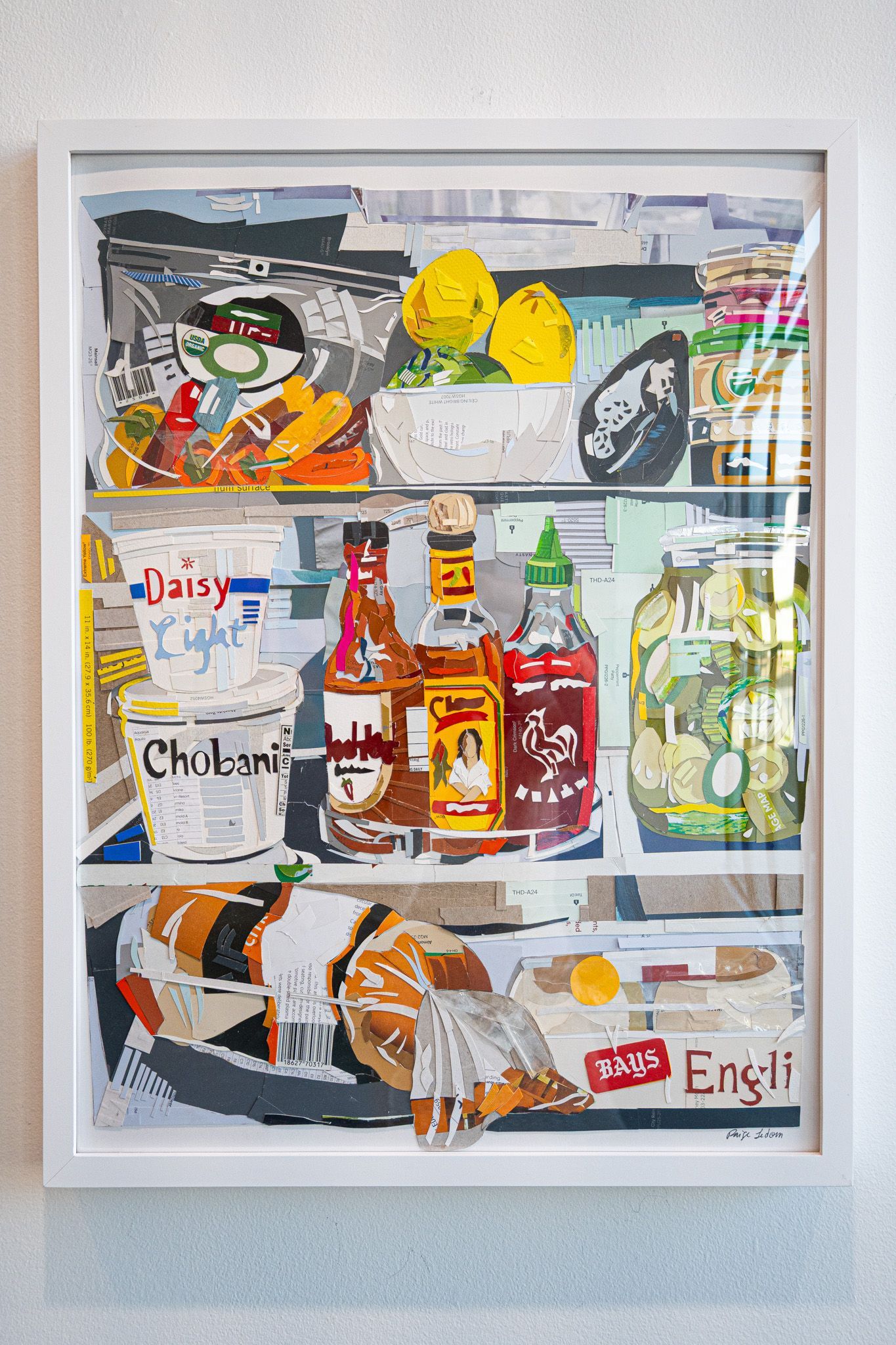
Line - a mix of sharpe, angular lines and soft, curved edges that mimic the forms of various grocery items. The layering of paper cutouts creates implied lines, guiding the viewer's eye across the shelves.
Shape - artwork is constructed using a variety of organic and geometric shapes. Rounded objects like lemons, jars, and bottles contrast with rectangular packaging and shelving to create visual balance.
Color - diverse color palette represented in the food packaging. The colors are varied and create a representation of the chaotic nature of most fridge interiors.
Texture - layering paper and printed text from the paint swtaches used as the medium provides a tactile quality. The texture of each fridge item is implied through the paper choices and cut lines.
Space - provide a structured, layered space and there is a sense of depth. The overlapping items and variation of size and detail enhance the perspective.
Value - different shades of paper to create highlights and shadow, giving each object volume.
Form - two-dimensional but has some elements of cut paper that are not smooth, which creates a three-dimensional feel.
Photography
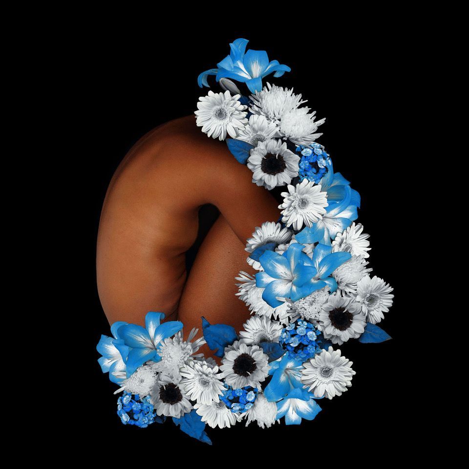
Line - curved posture of the figure forms a natural, flowing organic line, drawing attention to the shape and contours of the body. The flowers are arranged in a corresponding arc, creating circular movement for the central object.
Shape - the body introduces soft, rounded shapes in comparison to the more structural floral elements. The florals also add depth and variation as each shape is layered.
Color - limited and powerful, with the black background forcing the body and florals to the foreground. The natural skin tone and blue, black, and white stand out and come more important because of the contrast.
Texture - smooth, almost velvety of the skin contrasts with the delicate texture of the flowers. The combination of realism with digital collage techniques adds further contrast between soft and crisp textures.
Space - black background creates negative space, which isolates the subject
Value - interplay of light and shadow on the body and florals gives the entire composition a sculptural quality.
Form - the figure appears three-dimensional although residing in a two-dimensional object like a framed photograph. The layering of flowers over the body enhances the illusion of volume and movement, as they seem to almost emerge from the figure.
Principles of Design:
Once you understand these elements of art, you can now begin thinking about how each of them are arranged in a work of art. This is where the principles of design come in to play. These principles are how designers and art historians analyze artwork or design. Now we’ll look at how certain principles guide the interactions between these elements and the way they’ve evolved through the centuries from contributions of artists, architects, and theorists.
- Balance - visual weight and how it is distributed throughout a piece. For example, is the piece symmetrical or asymmetrical with its elements?
- Contrast - relationship between light versus dark, heavy versus light, big versus small, or rough versus smooth, to name a few.
- Emphasis - focal point or in other words, where your eye is drawn.
- Movement - the path the viewer’s eye follow from element to element in the composition.
- Pattern - created through the repetition of elements.
- Proportion and Scale - relationship between elements in term of their size.
- Unity and Variety - plays with cohesiveness between elements while still creating visual interest.
Why does this matter when buying art?
When you understand the anatomy of artwork, you can fully understand what your preferences are. They become clearer and more confident. Instead of saying “I just like it” or “I don’t know why this works for me” you can start recognizing patterns in your taste.
Here is an example of what you might be drawn to:
- High contrast and dramatic value shifts
- Subtle color palettes with strong texture
- Movement and asymmetry rather than perfect balance
What you’ve just read is one small piece of a much larger conversation. The book dives deeper into these ideas, offering practical ways to understand, teach, and engage with art more meaningfully. If this way of thinking about art resonates with you, you’re invited to preorder my book—shipping April 21, 2026!