
Art Meets Design: The Autumn Conservatory
A Four Seasons Room Dressed in Autumn’s Finest: How to Style Your Four Seasons Room for Every Season
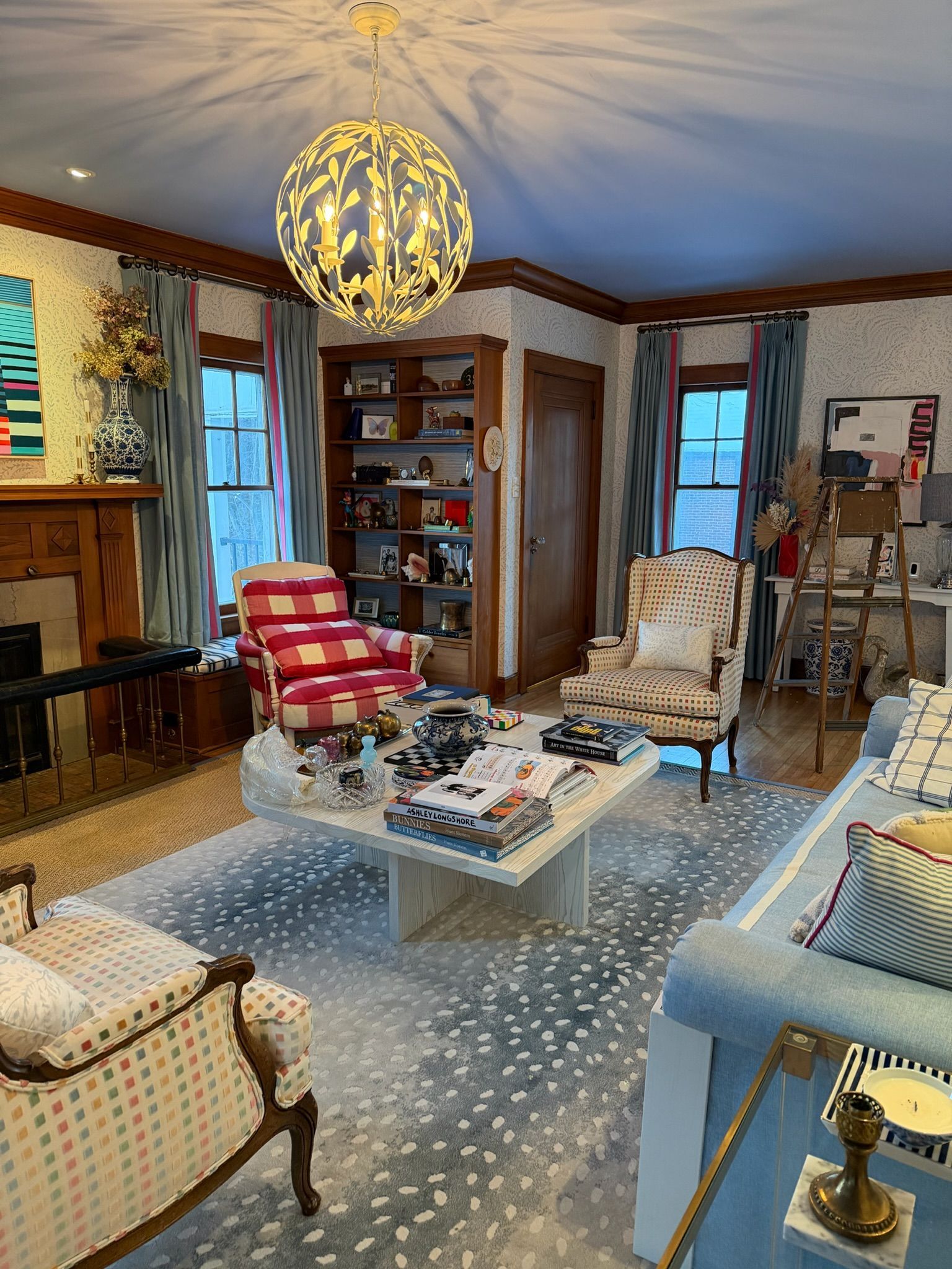
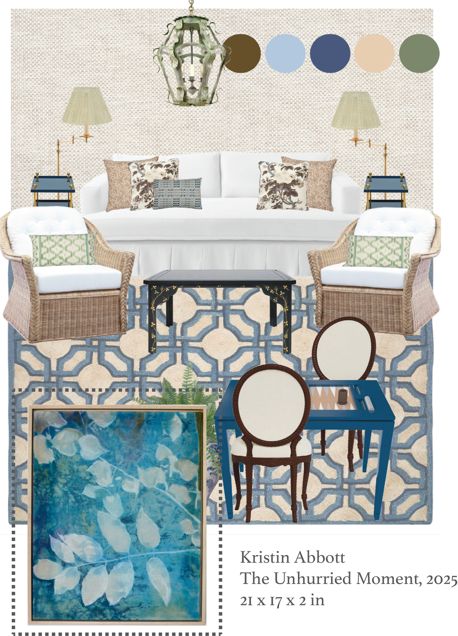
As summer’s bold, radiant colors fade, we find ourselves grounding in softer, calming neutrals. Stepping into this serene space, you’re invited to slow down and enjoy the view just beyond your windows. With a palette of browns, creams, greens, and blues, the room feels timeless and adaptable through every season. The natural tones of green and blue the landscape views that mirror the skies above and the grass below—creating harmony between indoors and out.
The Mood: Gentle, Soothing, and Tranquil
A four seasons room is designed to let you simply be—to breathe with the cooler breeze and unwind in comfort. Here, soft blues ripple through the space, offering a cooling, refreshing effect when paired with natural sunlight, airy whites, and creamy neutrals. Accents of green echo the landscape just beyond the windows, weaving nature inside through pillows, plants, and even the chandelier above. Rich browns anchor the palette—woven into the sofa trim, rattan chairs, and wood finishes—balancing the lighter tones so the room feels organic, welcoming, and timeless rather than overly modern.
Where Seasons Meet Art in Dialogue:
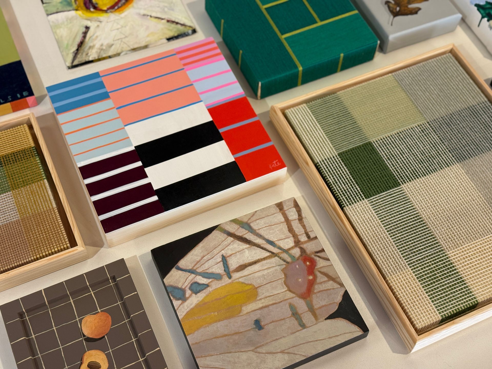
The textured wallpaper sets the tone for warmth and depth in this four seasons room, creating a backdrop that allows every other design element to shine. Its subtle pattern has a quiet strength, giving the walls some warmth while still leaving room for layers of artistry and design. To complement this foundation, I’ve woven Kristin Abbott’s artwork seamlessly into the scheme. Her pieces, rooted in the rhythms of nature, feel like an extension of the outdoors—bringing in the browns of earth, the creams of soft light, the greens of plants, and the blues of sky and water.
The palette doesn’t just decorate the room; it breathes with it. You’ll find echoes of these hues across the furniture, rug, pillows, and even the small details like the deep blue game table. Each color bounces gracefully off the next, creating a harmonious flow that ties the entire space together. Kristin’s work feels almost inevitable here—as though the room was always waiting for her art to complete the dialogue between outside to inside, and season to season.


Bringing It All Together:
When designing a space, it’s essential to start with the feeling you want the room to evoke. For this four seasons room, the goal was to create a sense of harmonious stillness—a sanctuary where everything simply exists as it is, inviting comfort and calm through every season. Whether you’re looking for a quiet spot to read, work on a puzzle, or simply take a mindful pause from the day, this room is designed for reflection, relaxation, and restorative breaks.
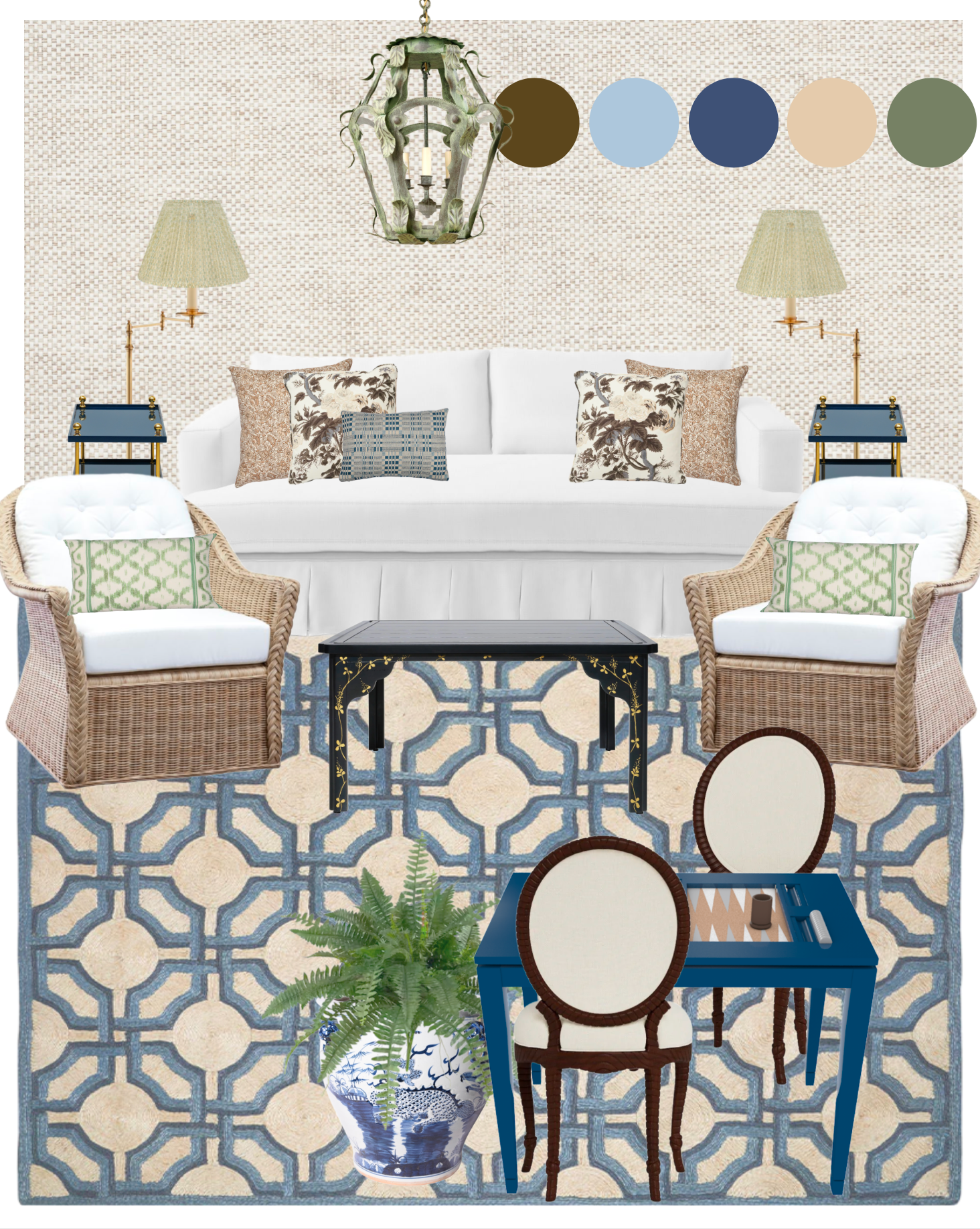
Soft, lightly green-and-white striped floor lamps introduce a gentle pattern that allows the space to breathe, while matching green-patterned pillows add depth and dimension, breaking up the starkness of the white furniture. A verdigris lantern draws inspiration from old-world European patina, bringing a touch of timeless charm and a subtle connection to the outdoors inside.
The crisp white furniture contributes to a fresh, modern feel, balancing the natural tones of darker woods and rattan elements that ground the room and echo the textures of a forested landscape. Hints of blue play into the analogous color scheme, fostering a sense of visual harmony and enhancing the room’s tranquil mood. Altogether, the layers of texture, pattern, and color work cohesively to create a space that feels organic, inviting, and perfectly attuned to the rhythm of all four seasons.
Designer Tips for a Multi-Seasonal Four Seasons Room:
Pro Tip #1:When the main function of a room is to feel restful, let that intention guide every choice, from the calming hues of the palette, to the tactile softness of materials, to the artwork that draws the eye gently without overwhelming. Each element should contribute to a sense of ease and restoration.
Pro Tip #2: When layering patterns, like a bold geometric rug with botanical or toile pillows, keep a consistent color palette to tie everything together. This allows you to mix scales and styles without overwhelming the space, and the artwork becomes the perfect bridge between elements.
Do you have a space—or several spaces—that don’t feel like you? Or rooms that sit unused because they just don’t work for your lifestyle or spark emotion? At Liz Lidgett Gallery + Design, we specialize in creating spaces that not only function flawlessly but also reflect your personality, passion, and artful taste.
Whether it’s reimagining a cheerful breakfast nook or redesigning an entire home, we’re here to help you have a home that truly brings you happiness. Let’s work together to transform your environment into a joyful, personalized haven.