
Our Take on Pantone’s Color of the Year: Cloud Dancer
My take on Pantone’s Color of the Year: Cloud Dancer 11-4021 TCX.
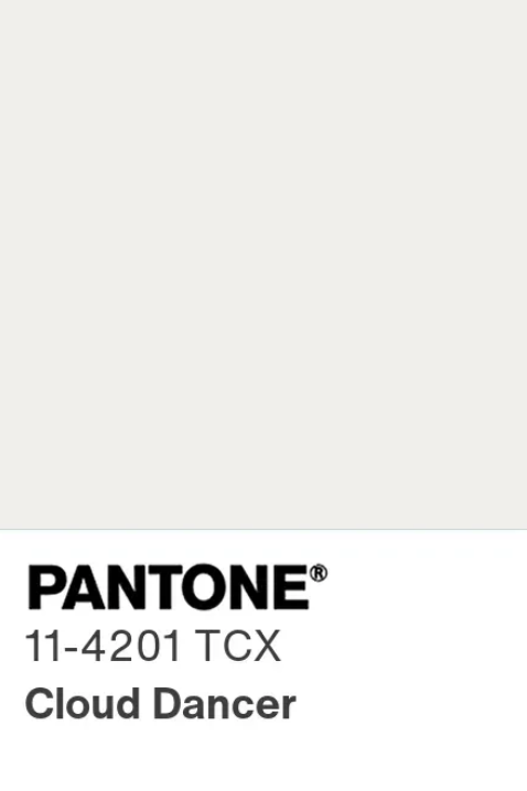
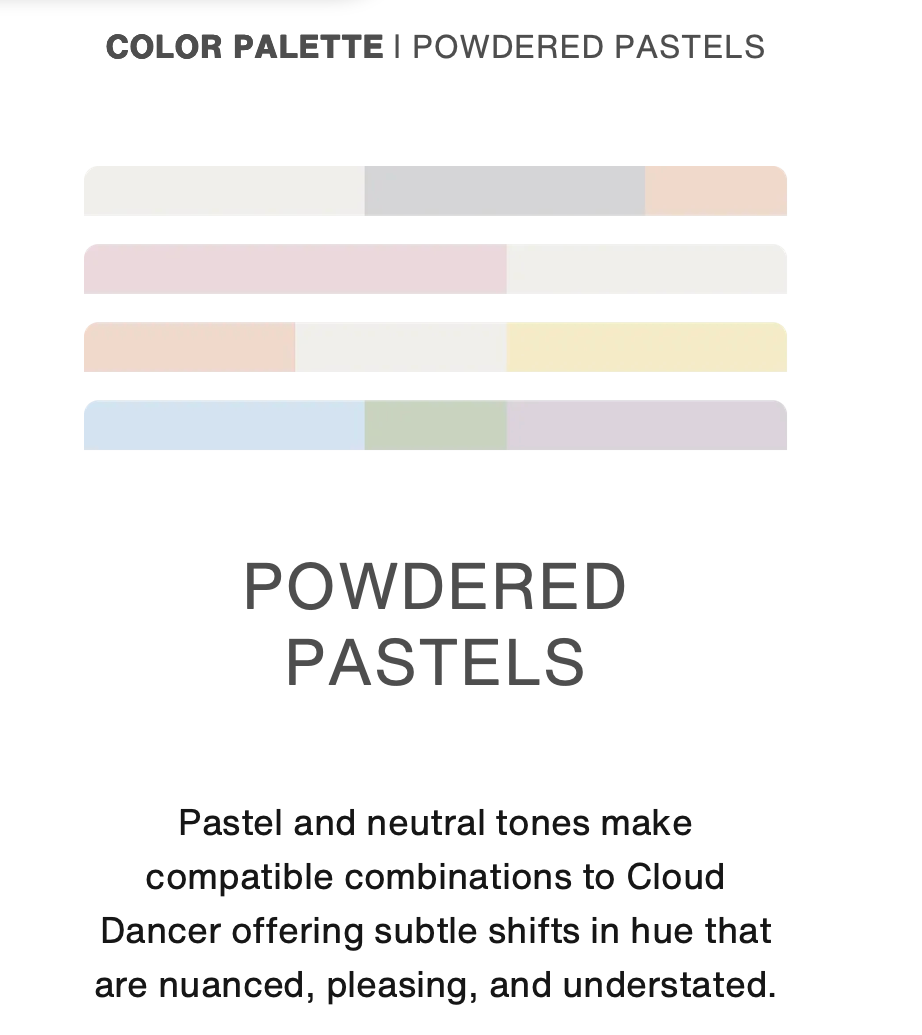
Every year Pantone selects a Color of the Year, which is typically a pre-existing color to then be embodied in a mood by the Pantone team. And as every year when it comes around, its arrival comes with a lot of fanfare and just as much opinion. Some colors throughout the years have felt extremely iconic and innovative, which others slowly grow on us or don’t at all. Cloud Dancer was named this year’s Color of the Year and we’re not entirely sure how to feel about it. Cloud Dancer reads as a soft off-white, but when you spend a little more time with it you will notice its subtle change in color. It falls into the latter category of subtle, quiet, and deceptively complex. It’s warm without being creamy and airy without feeling too cold. It’s a color that of course never demands attention, but it changes the perspective of everything around it.
A Neutral That Actually Feels Emotional
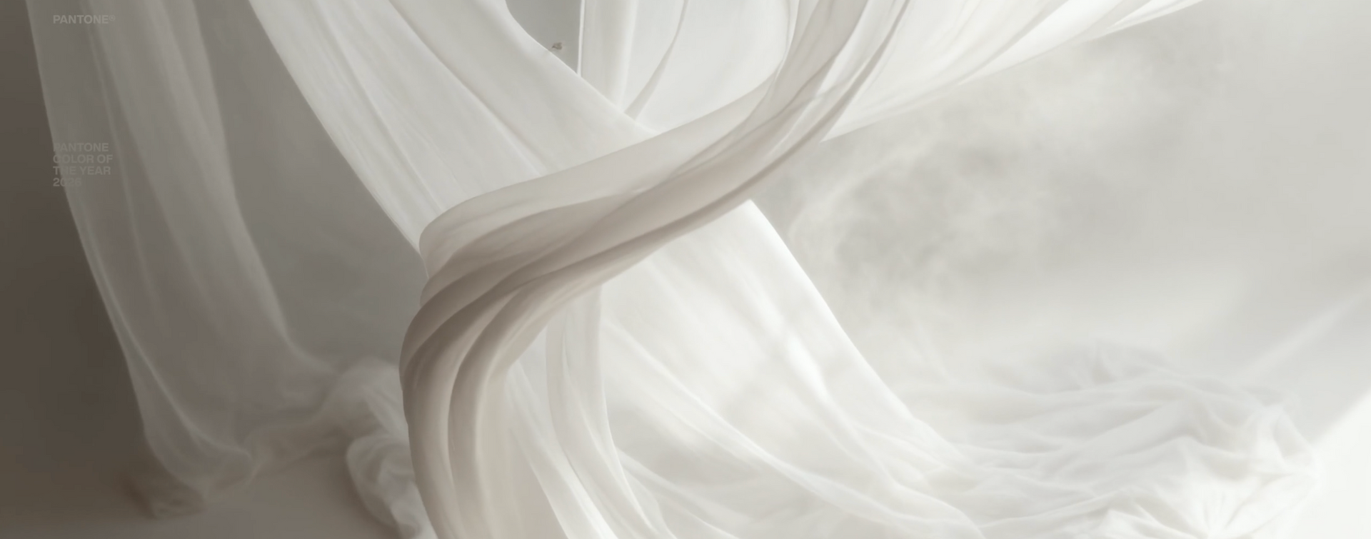
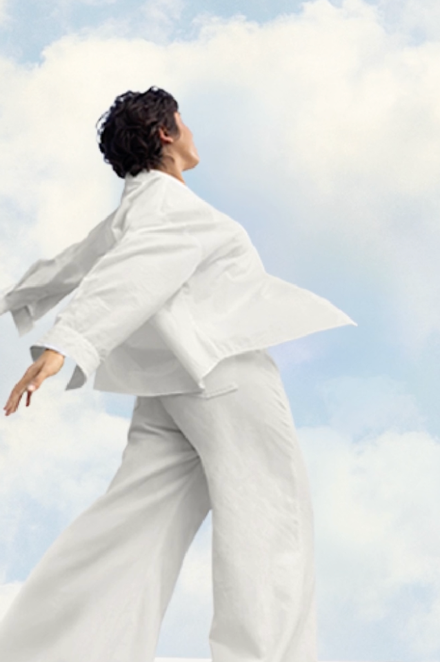
Although Cloud Dancer is simplistic, it is not its intent. In a moment where color trends often swing between hyper-saturated brights and deep, moody hues, Cloud Dancer offers restraint. It feels calming, grounding, and human. This isn’t the stark white of galleries or the sterile white of minimalism past. Instead, Cloud Dancer carries softness, almost like light filtered through sheer curtains or the quiet calm of an overcast morning. It presents pause, breath, and subtle presentation.
How Cloud Dancer Works in Art & Interiors
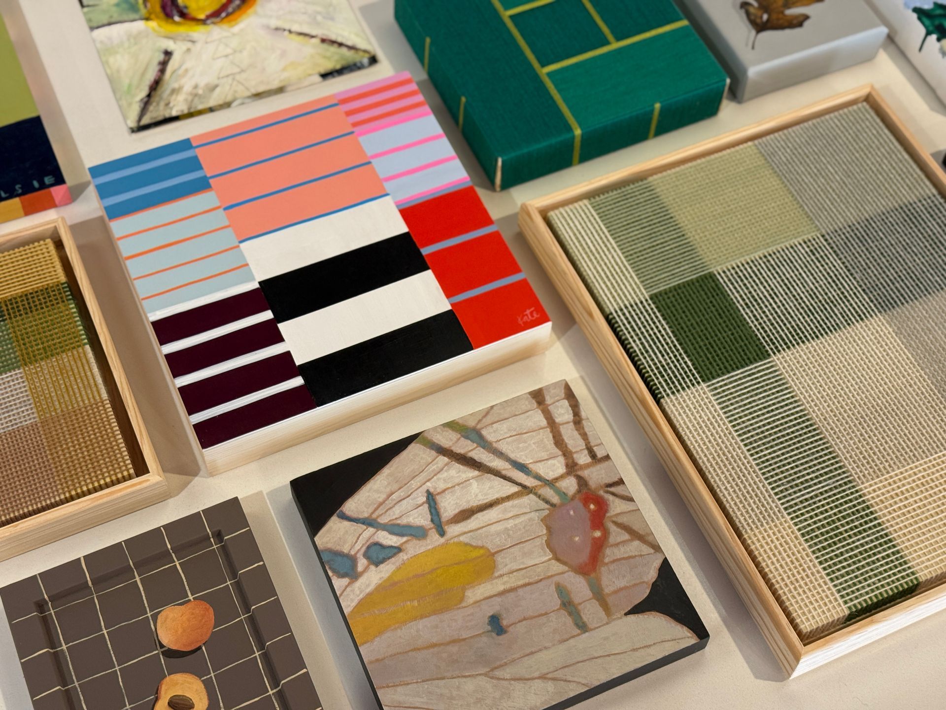
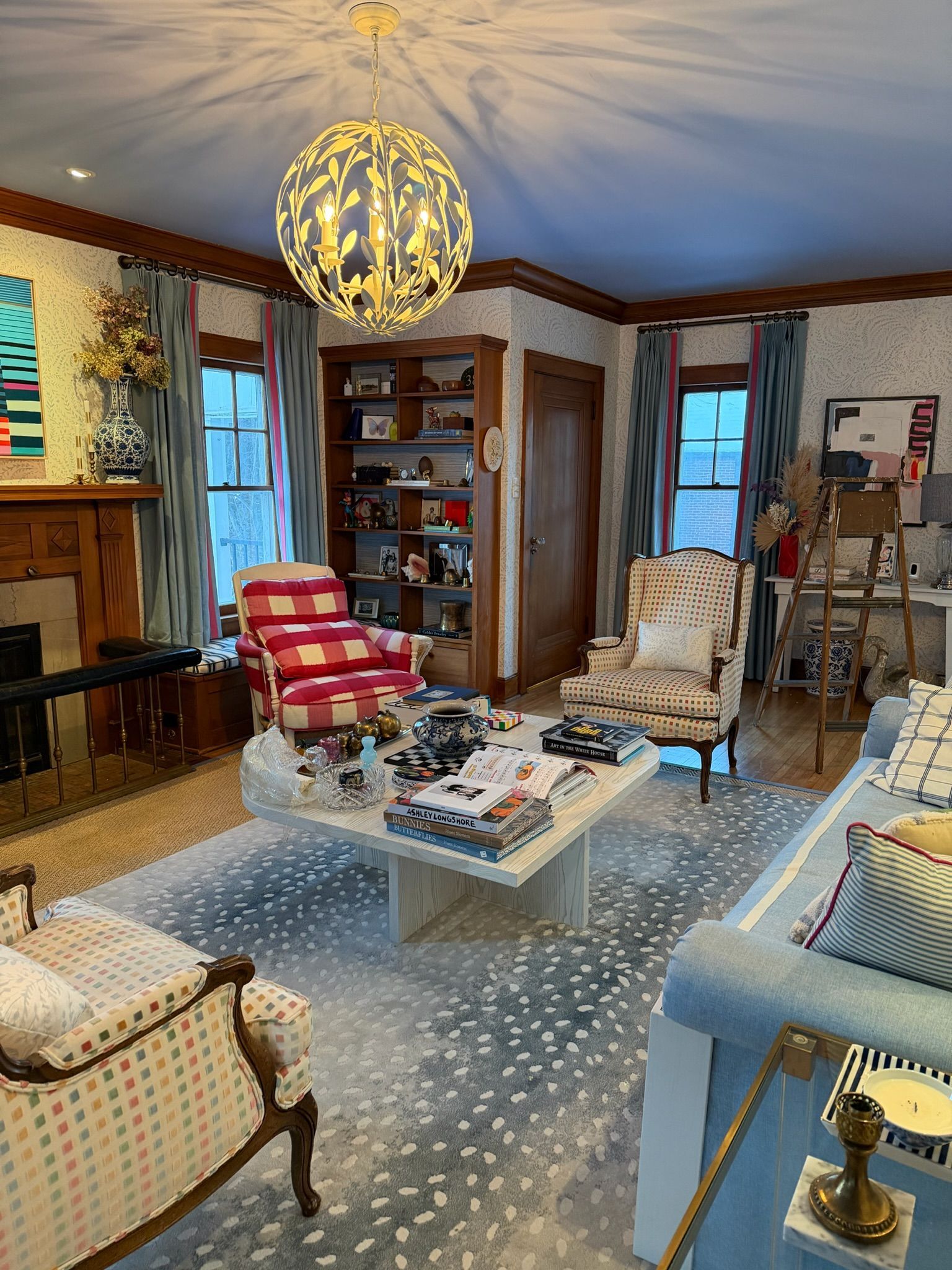
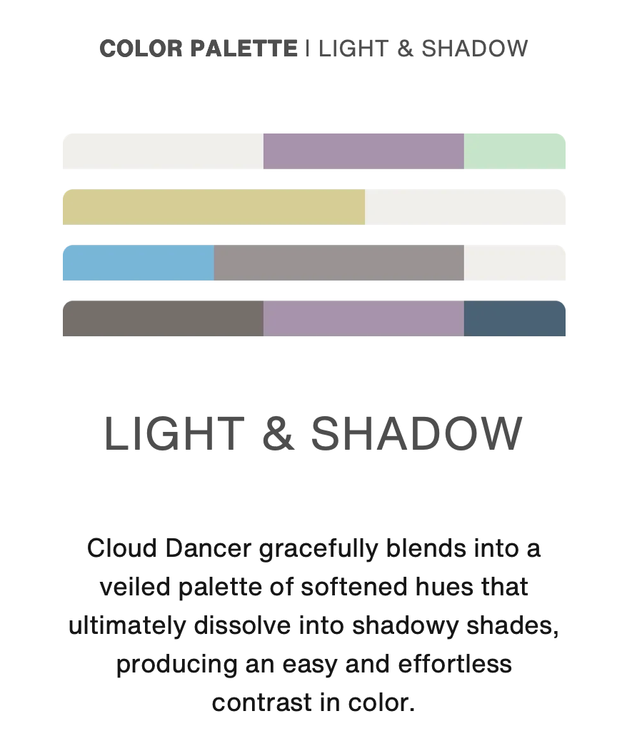
Cloud Dancer thrives as a backdrop. In art, it allows texture, bolder hues, and form to take center stage. It pairs beautifully with organic materials like linen, raw wood, stone, plaster. Cloud Dancer enhances sculptural work without competing with it. In interiors, it creates a sense of openness while still feeling warm. It plays well with both muted palettes and bolder accent colors, making it incredibly versatile. Think of it as a canvas rather than a statement piece. One of Cloud Dancer’s strongest qualities is how it elevates surrounding tones. Earthy browns feel richer and blues feel softer. It allows contrast without tension. For collectors and designers alike, this makes Cloud Dancer less of a trend color and more of a foundation.
My Take (from a designer POV)
Why the Pantone Color of the Year (Cloud Dancer 11-4021) feels underwhelming. White is already the default “supporting actor”. White is foundational in so many spaces already such as walls, trim, cabinetry. So naming it the Color of the Year feels like it’s highlight something that’s already everywhere. It feels like it wasn’t “new” nor exciting and rather it felt uninspiring, cold, and dare say boring??
Cloud Dancer doesn’t give clients “permission” to be brave, instead it’s pushing for safety. A Color of the Year often helps people try a hue they wouldn’t typically choose. White doesn’t push anyone past safety, if anything, it reinforces the “play it neutral” impulsive decision-makers. I can’t tell you how many times individuals come to me and want to “play it safe” with a form a white incase their home becomes “outdated”. But where’s the personality in that? Being boldly yourself is how your space should kindly mirror your personality.
White isn’t a color story on its own, it’s a content story. In real homes, white only becomes interesting through undertones, light exposure, sheen, texture, and contrast. Without layering, it reads flat or clinical REALLY fast. Remember when Kim Kardashian released her home to Architectural Digest in 2020 and how everyone originally loved it. Then closely after that many reviews came back clapping back at how it felt clinical and “hospital-like”. With no other context this color isn’t anything.
Cloud Dancer feels like a HUGE missed opportunity for joy. After years where the Color of the Year choices were emotionally expressive, a white pick can land as “quiet” when designer crave “liveliness”. Even if calm is the intent, this relates back to the color story vs content story. Cloud Dancer can’t become anything without all of its supporting actors and at that point, why is it the Color of the Year?
Pantone is positioning Cloud Dancer as a calming “blank canvas”— You can agree with the why and still feel like the result is uninspiring for interiors. Here are some of the public opinions who have said the same:
- “White is timeless—but a Color of the Year should feel timely.”
- “Cloud Dancer is a gorgeous backdrop. I just wish the headline was bolder.”
- “If the color of the year is a blank canvas… then the excitement has to come from what we paint on it.”
As an interior designer, I genuinely appreciate white. It’s classic, flexible, and it can make a space feel airy and elevated when it’s done well. But I’ll be honest: when the “Color of the Year” is white, it feels a little… anticlimactic. White is already the backbone of so many interiors like trim, ceilings, cabinetry, walls—so naming it the standout color doesn’t feel like a fresh direction.
A color of the year usually gives us a spark: something that nudges clients to be bolder, helps shape new palettes, and adds energy to the design conversation. White doesn’t really do that. It doesn’t challenge, surprise, or open a door to a new mood in the same way a richer hue can.And the thing is: white isn’t one simple choice in real life. The magic of white is in the details—undertones, light exposure, sheen, texture, contrast. Without those layers, it can quickly fall flat or feel sterile. So while I understand the appeal of a calm, clean “reset,” I’m personally craving more excitement and more story. I want a color that makes you feel something the second you see it.
For me, white will always be an essential part of great design—but I look to “color of the year” to bring a little more thrill, inspiration, and momentum. White is the perfect supporting character. I just don’t love it as the headline.