
Why Orange Deserves Some Love
The science behind the most “slept on” color. Orange is one of those colors that always seems to spark debate. It’s bold, it’s energetic, it’s everywhere in nature—and yet, when it comes to personal preference, orange often gets the cold shoulder.

The Popularity Problem
In a recent Colorlib study, 30% of women voted orange as their least favorite color, followed closely by brown at 23% and purple at 13%. For men and women between 35 and 80, orange also came in at the bottom of the list. And when it comes to design? Orange doesn’t fare much better. Both orange and yellow were ranked as the worst colors for websites and ads. Why? Orange buttons and graphics were often described as “too harsh,” which made them the least likely to drive clicks or sales.
But Here’s the Twist
Even though orange is voted down in surveys, when people were asked what the color actually makes them feel, the answers were only positive vibes. In a 2025 Springer Link poll, participants said orange sparked happiness, excitement, fun, surprise, and even pleasure. Scientifically, orange is known as a high-arousal, high-power color—one that grabs your attention, boosts energy, and sets a lively tone. Compare that to brown, another low-ranking color, which evoked sadness, boredom, and disgust. Orange clearly has the better emotional résumé.
Why the Disconnect?
So why do so many people avoid a color that makes us feel good? The answer lies in orange’s associations.
- Warning signals: Think traffic cones, construction signs, or even bright patterns in animals that signal danger. Orange naturally reads as alert and aggressive.
- Context matters: In calm environments—like home interiors or study spaces—orange can feel too much. Many of us prefer colors that bring peace and quiet, like blues, greens, and neutrals.
- Cultural baggage: Orange can be tied to negative contexts too—prison uniforms, cheap branding, or being seen as “over the top.”
When Orange Shines and Our Solution
Of course, orange also has its moments of glory. In autumn, it’s everywhere: pumpkins, changing leaves, Halloween decor, even (my personal favorite) spiced lattes. During Autumnal season, orange feels festive, nostalgic, and natural. Its warmth makes it a star player, even among those who don’t usually gravitate toward it.
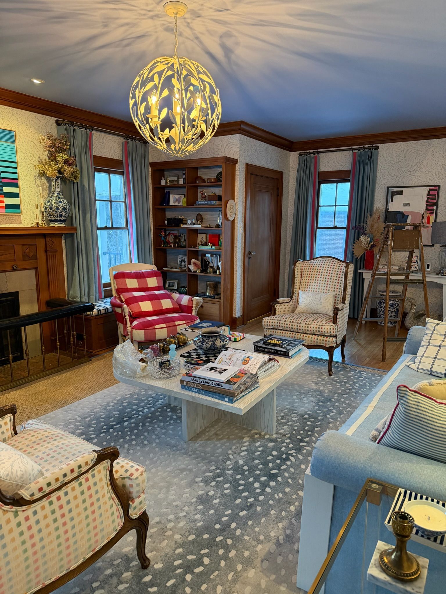
Orange is a paradox: a color that emotionally excites us yet culturally and contextually pushes us away. Maybe the question isn’t why nobody loves orange—but how we can start celebrating it in spaces where its vibrancy belongs. After all, orange is joy, fun, and energy all rolled into one. Orange can be tricky to use—but when paired thoughtfully, it can completely transform a space or a piece of artwork. The key is finding colors that balance, enhance, or complement its energy. Here are some of our favorite pairings for interiors, décor, and art:
Blue – Orange’s complementary color, blue creates a striking contrast that instantly draws the eye. In design, this combination feels visually dynamic but still balanced. Pairing burnt orange with navy in a gallery wall, for example, or a tangerine accent chair against a soft sky-blue wall, lets orange pop without feeling overwhelming. It’s a classic way to add energy while keeping harmony.
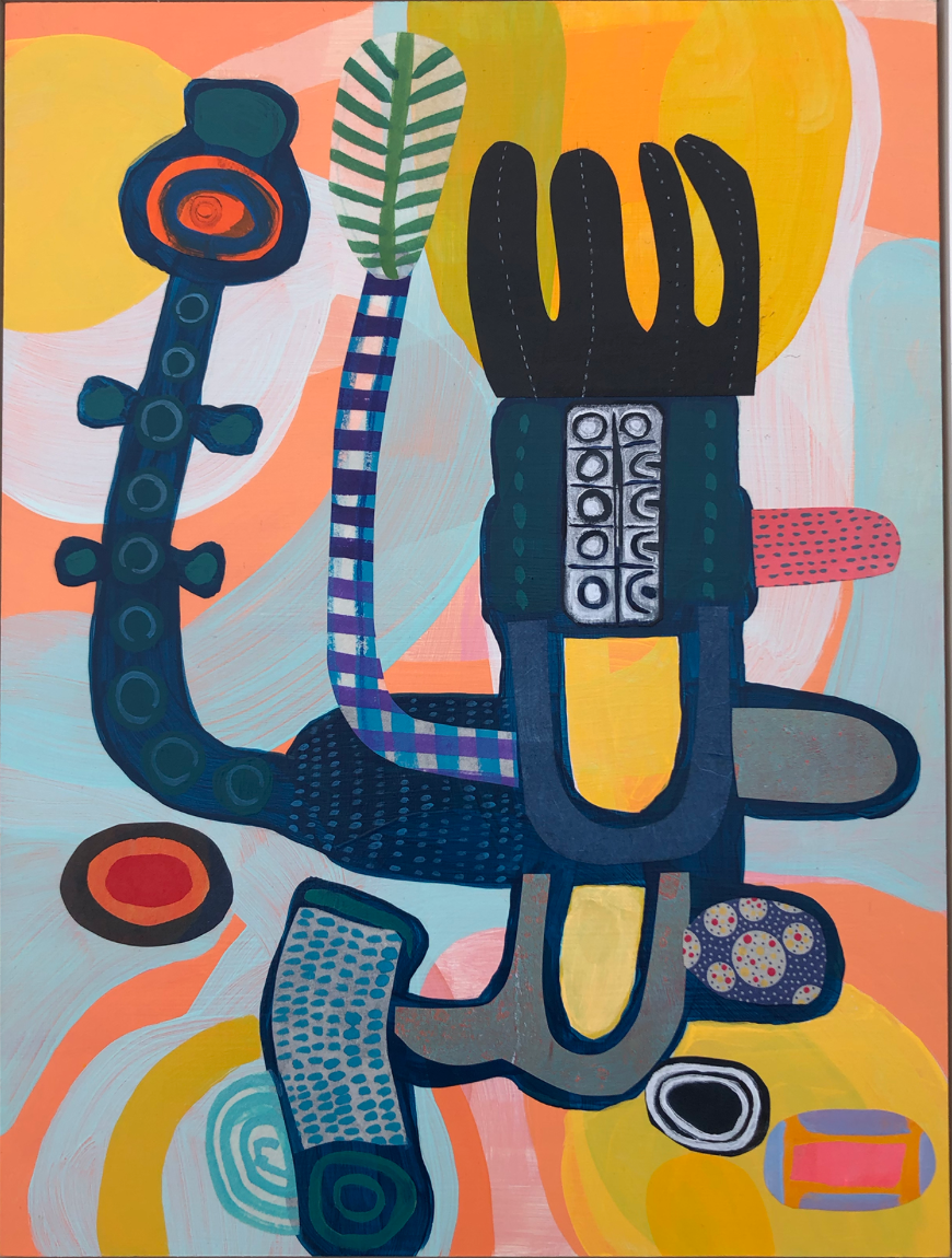
Alex Ackerman has paired her work,
Part Plant, Park Machine, 2024 with a navy blue to strike a contrast that instantly balances the work throughout.
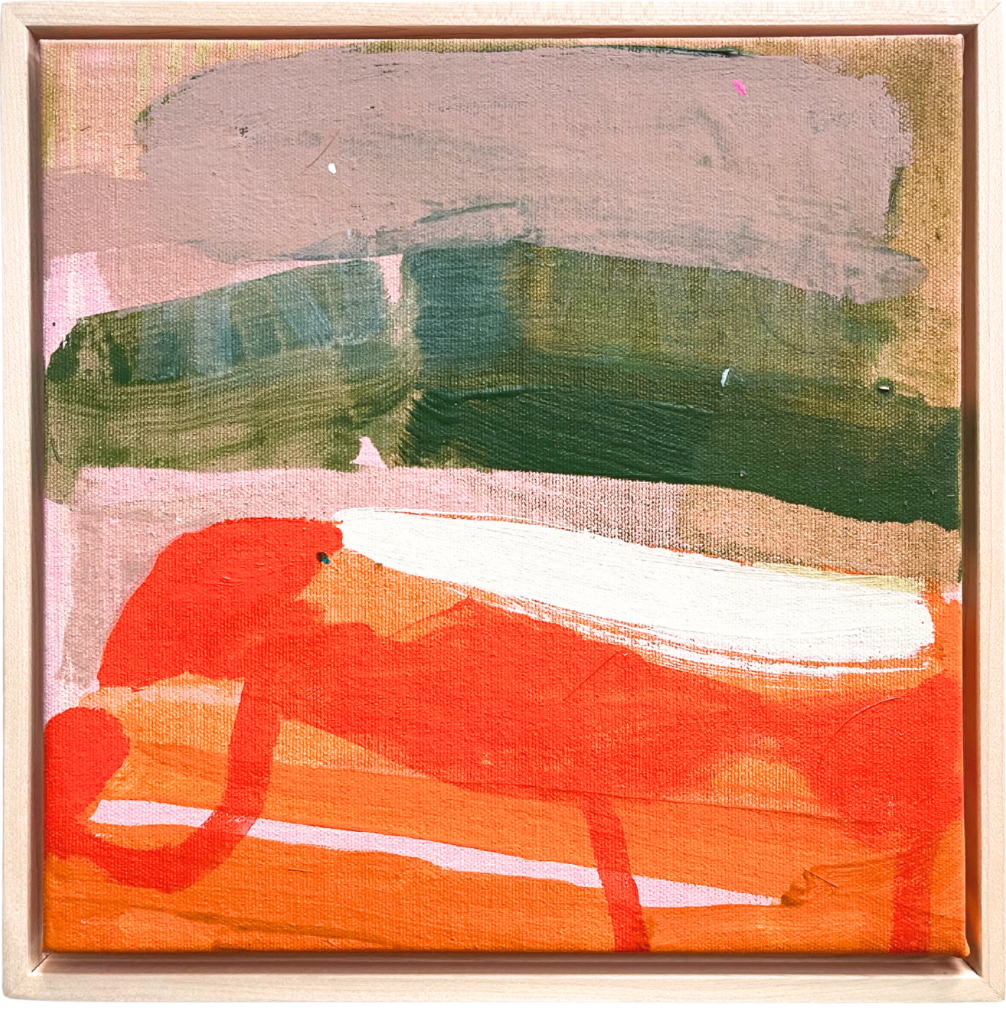
Dusky Pinks & Mauves – Now, here’s a pairing that feels unexpected but oh-so-right. Dusky pinks and mauves are warm, moody, and totally harmonious with orange. They share those same cozy undertones, making everything feel layered and thoughtfully styled. Picture this: blush wallpaper, deep green furniture, and little pops of orange in your artwork or décor. It’s chic, playful, and perfect for interiors that want a fashion-forward vibe.
Allison James has paired her painting,
Sweet Slice, 2025
with simply warm colors. Her work doesn’t just feel timeless—it wraps you up like a cozy autumn day, full of rich, warm tones. She married both Dusky Pinks with Muted Greens, making her abstract art a perfect visual harmony.
Muted Greens – Honestly, is there a color that doesn’t pair well with green? I haven’t found one yet! Muted greens like olive or sage are the perfect chill sidekick for orange. They tone down the high-energy vibes of orange and give you a modern, balanced palette. Think olive-green printed walls with apricot or burnt-orange accents in artwork, throw pillows, or décor—it’s natural, sophisticated, and just plain cozy.
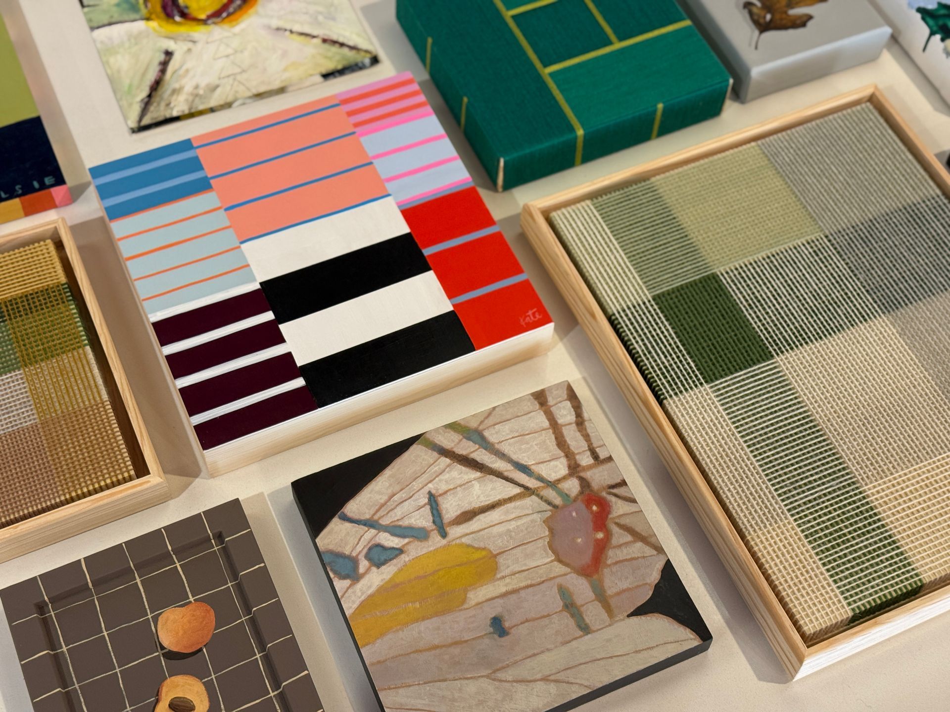
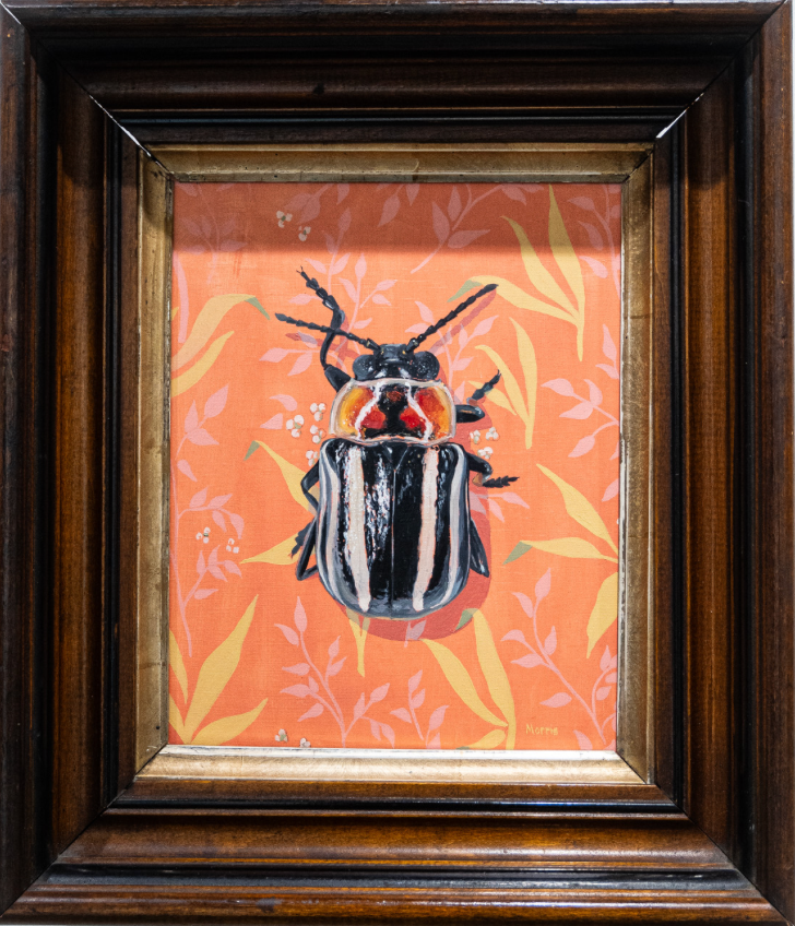
Earthy Browns & Wood Tones – Nature is orange’s perfect partner. Wood and leather tones mimic the natural environments where oranges thrive—think autumn leaves, clay pots, or sun-warmed landscapes. Pairing burnt orange with oak furniture, leather chairs, or wooden picture frames creates a warm, inviting aesthetic that feels both organic and comforting. In art, this pairing adds depth and texture, letting vibrant orange tones anchor a piece or tie together a composition. Kevin Brent Morris framed his Amaranth, 2024 beetle painting in wood, grounding the vivid orange base and letting it feel right at home in its natural element.
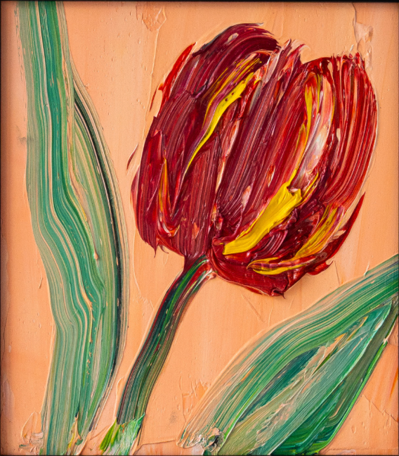
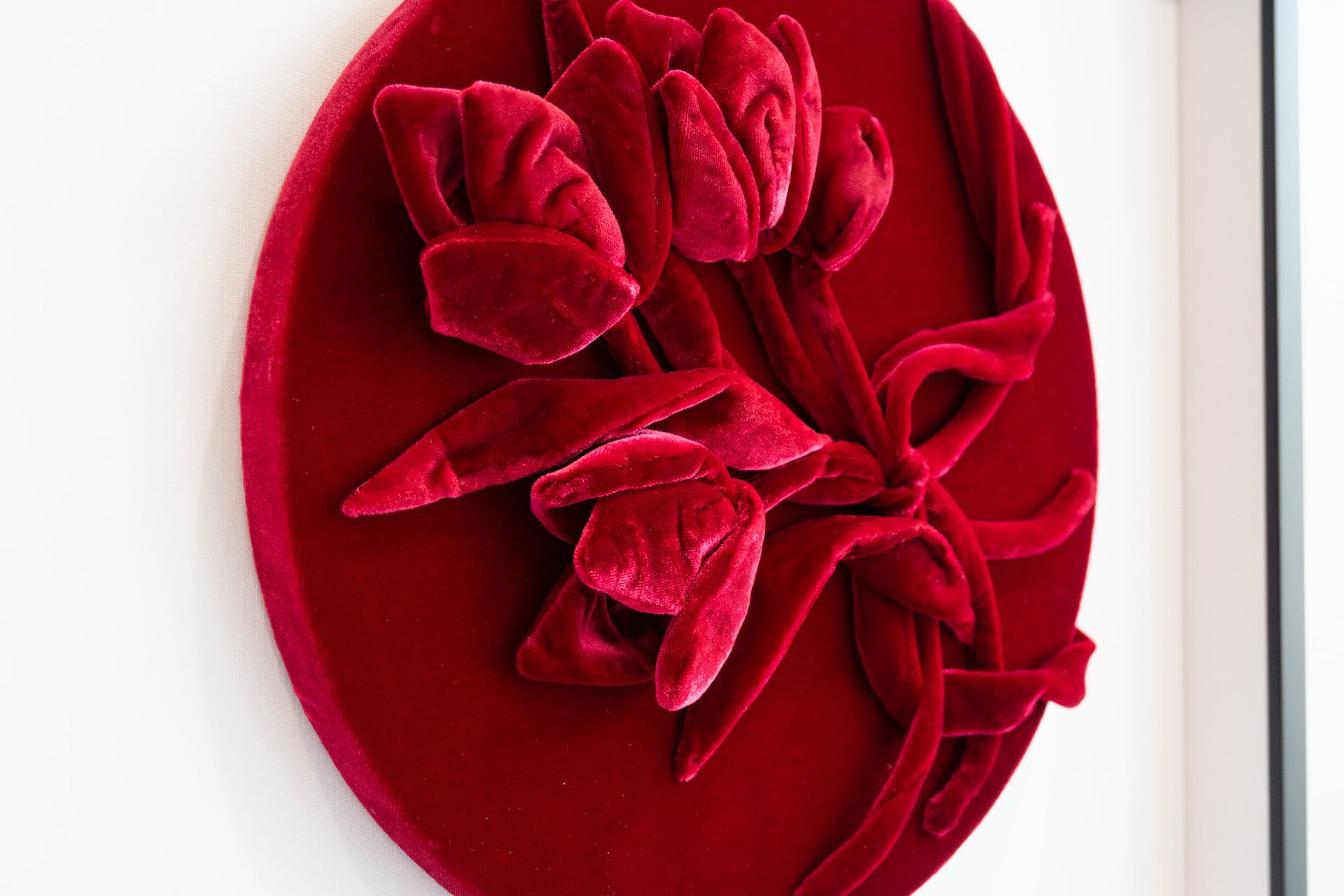
Teal & Deep Green – Sitting near blue on the color wheel, teal brings a calm, sophisticated energy that contrasts beautifully with warm oranges. Think rust-orange vases on a teal shelf, or terracotta-hued artwork framed against teal walls. This pairing has become a go-to for contemporary interiors because it feels both trendy and timeless. Muted olive or deep green works in the same way, softening the high energy of orange while maintaining visual interest. Hunt Slonem balanced his soft peach-orange with strokes of teal and deep green along the tulip stem, creating a thoughtful play of secondary colors that feel rich without overpowering.
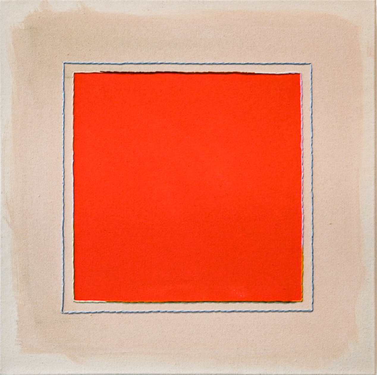
Neutrals (beige, cream, tan, or gray) – Neutrals are orange’s best friends when it comes to letting the color shine without dominating a space. By providing a soft, muted backdrop, creams and tans allow burnt orange or poppy accents to stand out in furniture, throw pillows, or art pieces. Gray walls paired with rust-orange ceramics or accessories create a grounded, sophisticated palette that’s easy on the eyes while still making a statement. By placing her bold orange box on a soft beige background, Emily Keating Snyder lets the colors in her work radiate together without stealing the spotlight from one another
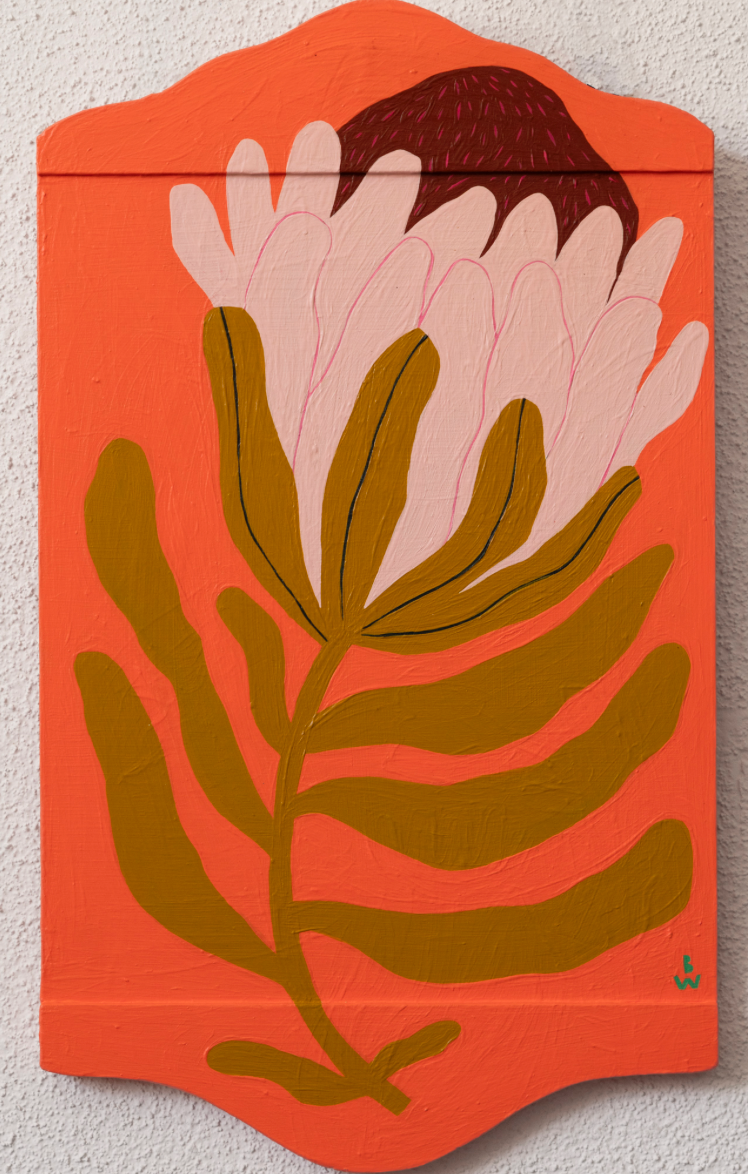
Orange as an Accent – Let’s be real—orange is bold, and it knows it. Bright, neon oranges are perfect for playful spots like a kids’ playroom or a funky statement piece. But in home interiors, we’re all about the burnt, rust, and persimmon tones. These shades feel warm, cozy, and sophisticated without screaming for attention. Pro tip: keep it in small doses—throw pillows, artwork, a statement vase—so your space feels vibrant but not overwhelming. And if you want soft and approachable, peachy oranges are your friend—they’re easy on the eyes and totally charming in bedrooms, art, or even a watch strap. Bekah Worley is a perfect example of how different shades of orange can play off each other. She pairs a bright red-orange with a softer peachy tone, creating harmony instead of chaos.
All in all of JUSTICE FOR ORANGE:
At the end of the day, orange is all about energy, fun, and personality. Pair it thoughtfully, pick the right shade for the vibe you’re going for, and suddenly even the most “too loud” orange can feel like it belongs. From your walls to your artwork to your outfits, orange is ready to shine—just let it.