Forecasting Pantone’s 2026 Color of the Year
As September winds down, we’re already looking ahead to 2026—a year forecasted to feel earthy and full of connection. With insights from Sherwin-Williams, Valspar, Behr, and Glidden, these colors have been building throughout trends all of 2025.
This year, leading paint brands are leaning into a natural palette—centered on shades of green and soft, off-white khaki-inspired neutrals. The question remains: will Pantone follow suit with another variation of green, or perhaps a neutral, as we saw with last year’s (2025) brown selection? As personal style becomes more individualized, color is playing a stronger role in our daily lives. From Sherwin-Williams’ pick of Khaki and Glidden’s Warm Mahogany, to Valspar’s Warm Eucalyptus and Behr’s Hidden Gem, the forecast is pointing toward a harmonious mix of neutrals and warm jewel-tones.
Sherwin Williams:
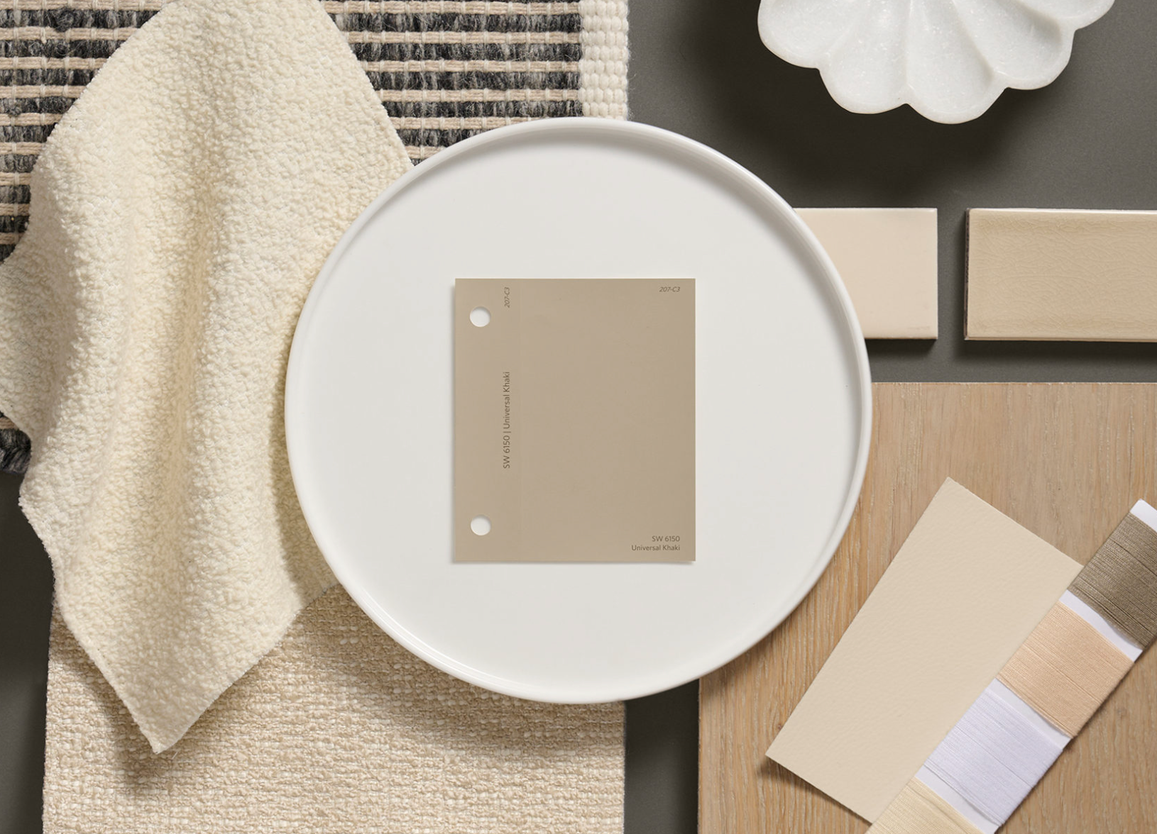
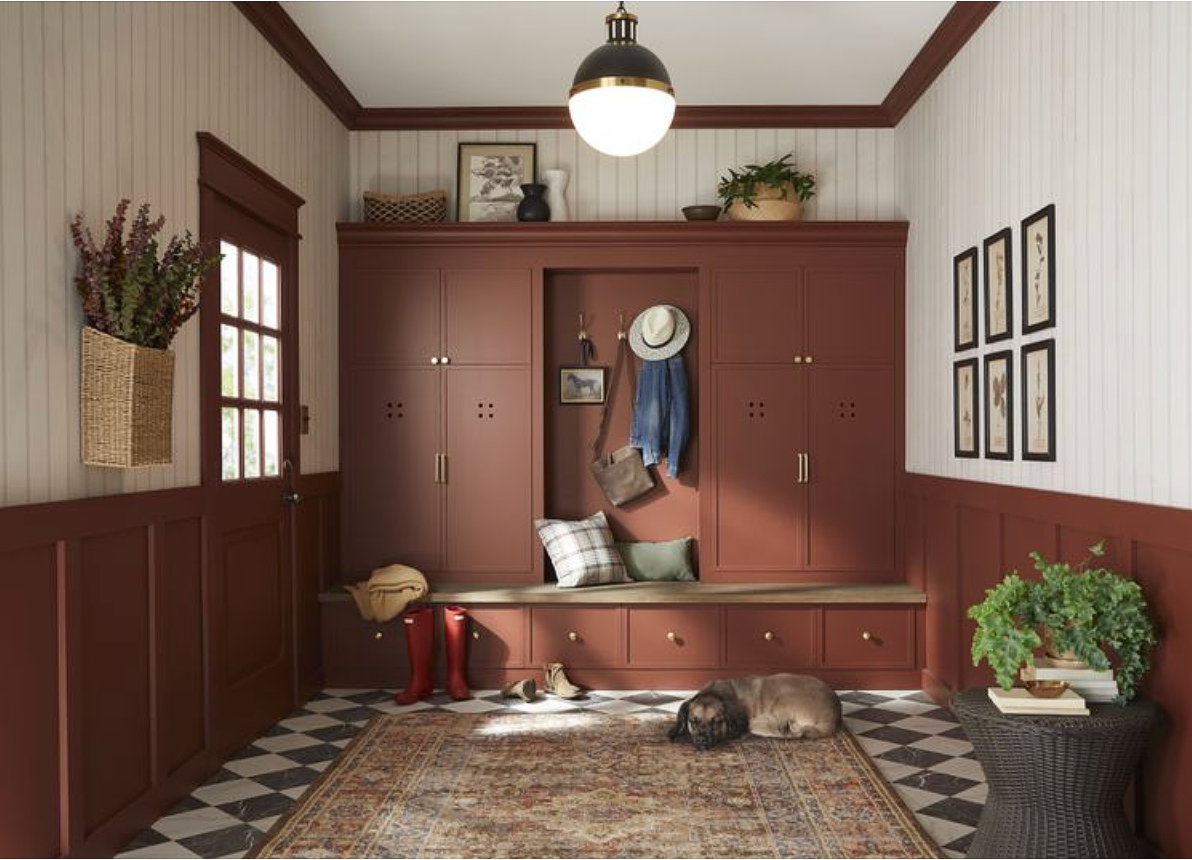
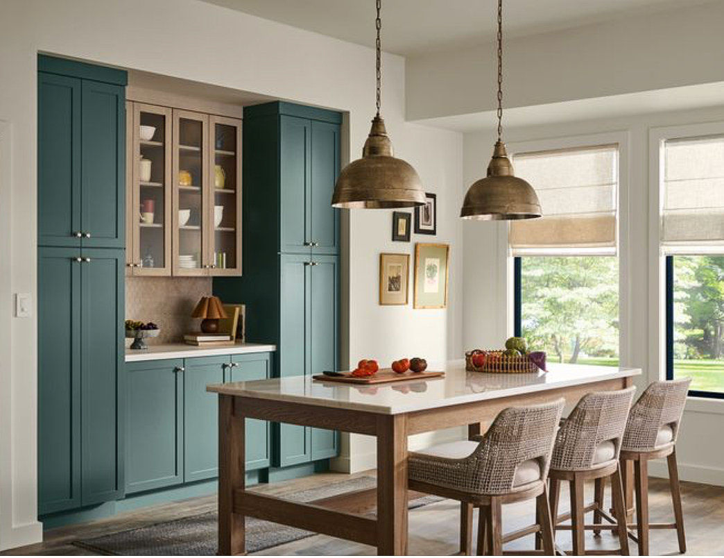
Universal Khaki —
Sherwin-Williams has officially named Universal Khaki the Color of the Year for 2026, and honestly, it feels just right. As we continue to lean into eco-inspired living, design trends are becoming less about being quick and flashy and more about what lasts—quality hardware, timeless simplicity, and nature-driven aesthetics that feel worth the investment.
Universal Khaki captures all of that. It’s a mid-tone neutral that knows how to stay classic while still giving off a fresh, modern edge. It’s warm, it’s layered, it’s elegant without trying too hard—and it feels like the kind of shade that will never fade out of style. Like Sue Wadden, Director of Color Marketing at Sherwin-Williams, puts it: “There’s something enduring about khaki—it bridges the past and the future in a way that feels both familiar and forward-thinking.”
The beauty of Universal Khaki is that it celebrates the essentials: functionality, timelessness, and a natural ease. It doesn’t scream for attention, but it has presence—it makes a space feel grounded while still elevated. And if you think about it, khaki has always had that kind of story. What started as a practical color for uniforms in the early 20th century quickly became a staple in everyday fashion. By mid-century, khaki was synonymous with comfort, craftsmanship, and versatility. Fast forward to today, and that same reputation is carrying it into interiors—where it’s ready to do exactly what it’s always done: stand the test of time.
Universal Khaki is proof that the simplest shades are often the ones that say the most.
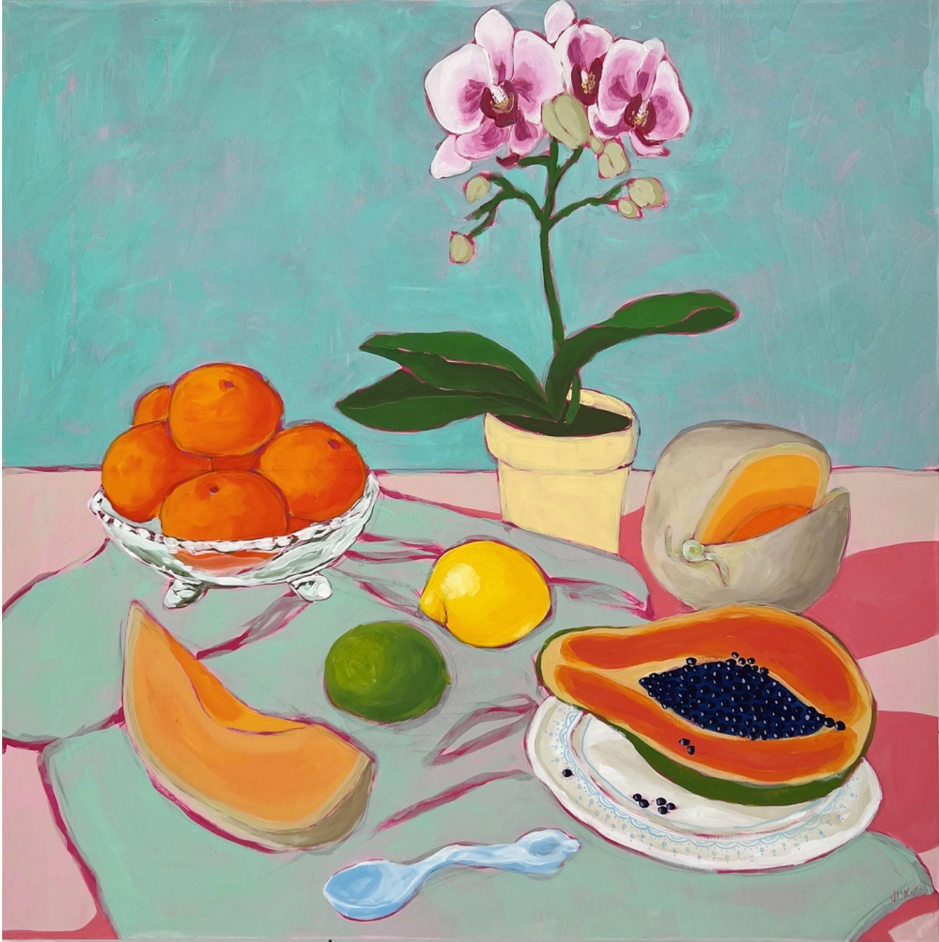
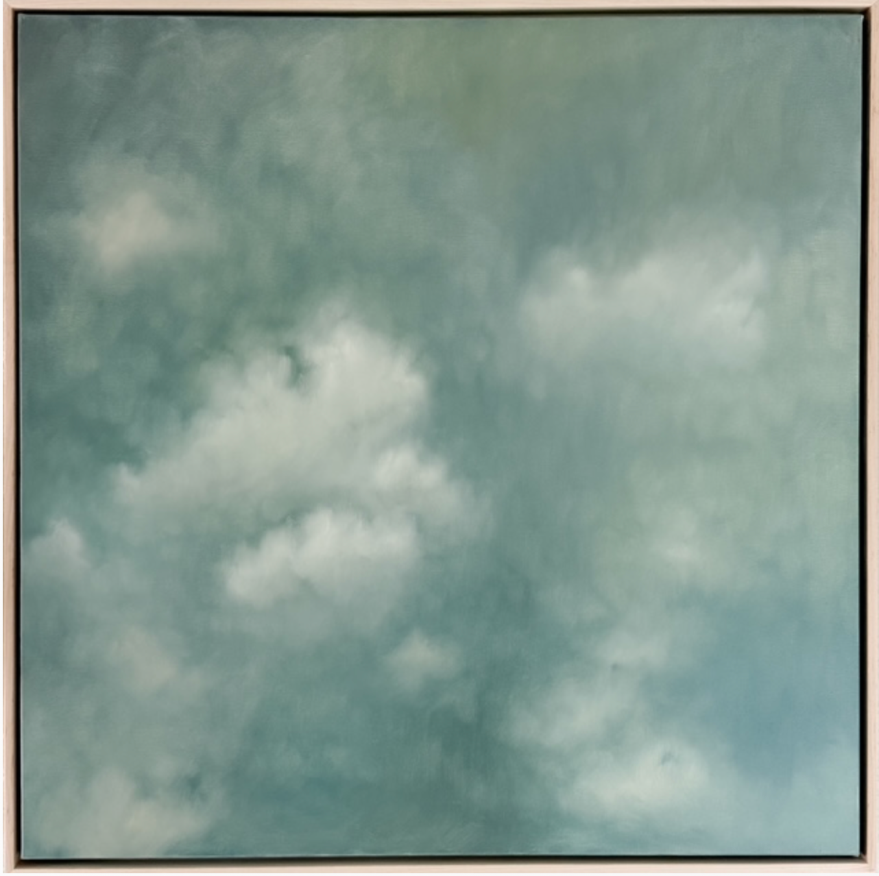
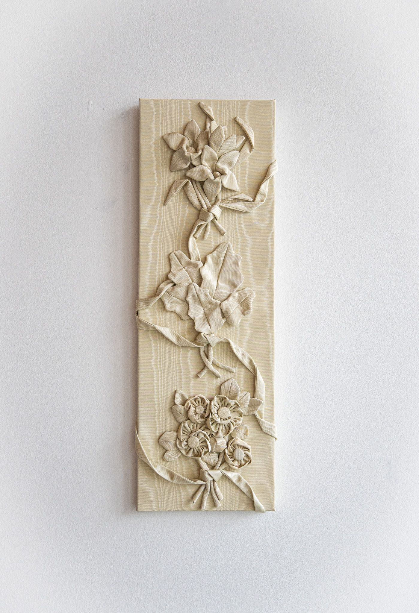
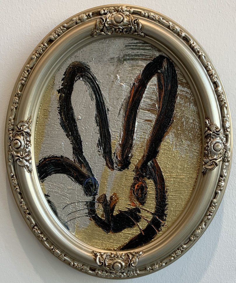
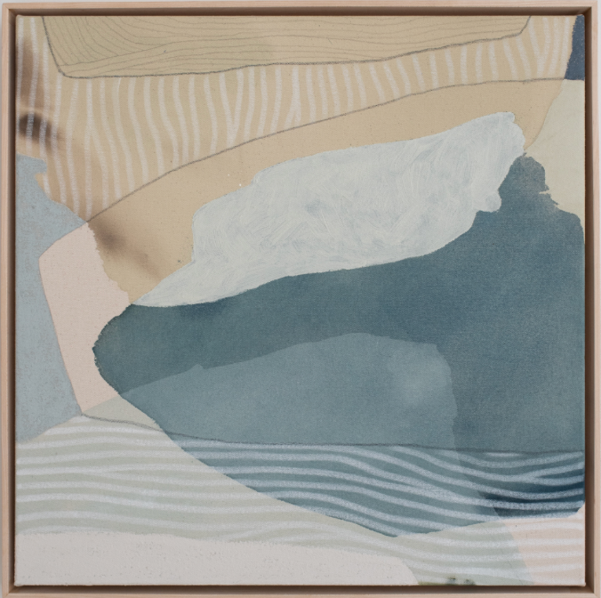
How we would pair Universal Khaki with art:
Universal Khaki has an undeniably earthy quality, yet it carries a refined sophistication at the same time. Pairing it with fine art—whether abstract paintings or still-life pieces—keeps a space feeling elevated while still leaning into its minimalist nature.
Rooted in European and Spanish-inspired interiors, khaki offers endless layering opportunities. You can take it in two distinct directions: minimalist, by keeping the palette balanced with khakis, browns, creams, and whites alongside natural materials like stone or cement; or maximalist, by introducing bold patterns, diverse textures, and statement finishes. The beauty of Universal Khaki lies in its flexibility. At its core, it invites the outdoors in—its nature-like hue pairs beautifully with colors such as softer blues, warm creams, and lively oranges. These touches bring energy and warmth, shifting a room from “always sophisticated” to something more welcoming and full of personality.
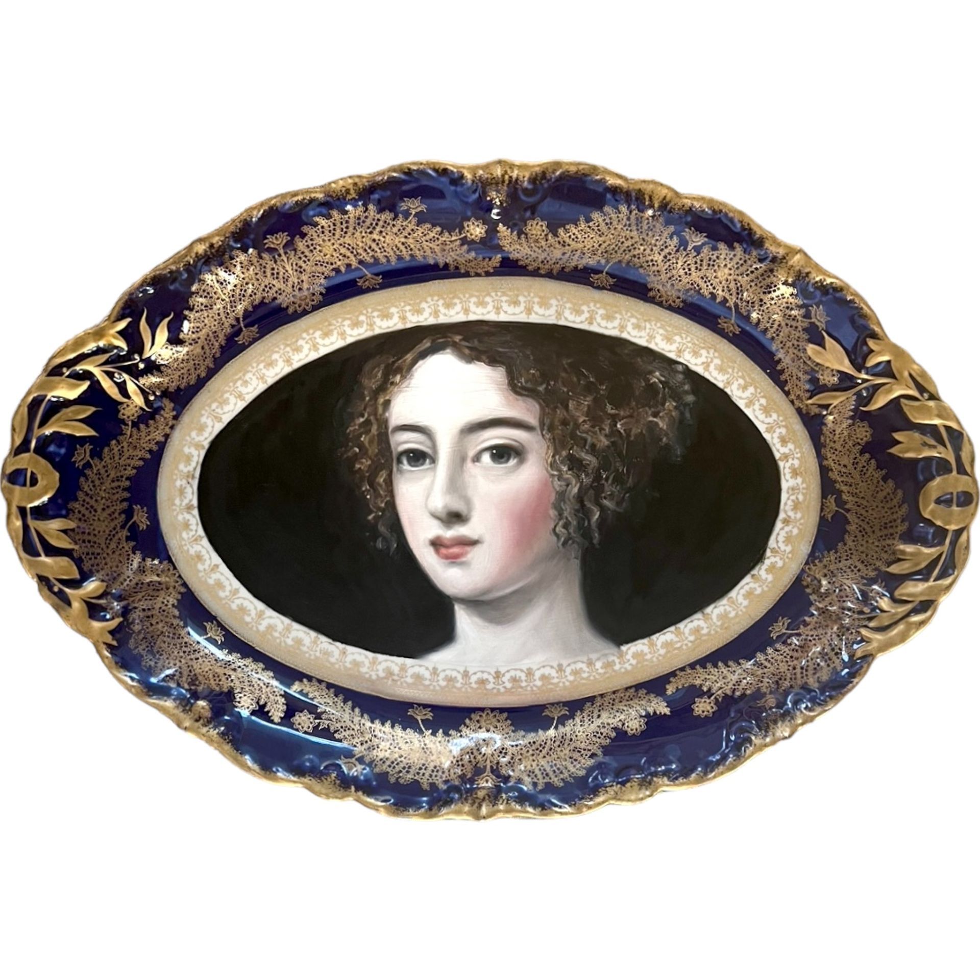
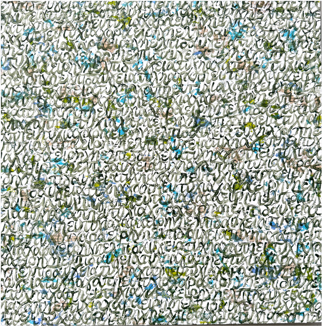
Often, khaki gets paired with landscape art—and while that’s always a solid choice, we like to show how it can go further. Universal Khaki by Sherwin-Williams is not just a background neutral; it’s a foundation for play, layering, and color exploration. It proves you can have sophistication and fun, without tipping into overpowering or overly maximalist territory.
Valspar:
Warm Eucalyptus —
Valspar has announced Warm Eucalyptus as their 2026 Color of the Year, and it’s a shade that instantly feels restorative—inside and out. Much like Sherwin-Williams’ Universal Khaki, this choice reflects a growing movement toward colors inspired by the natural world.
Warm Eucalyptus embodies calm, balance, and mindful living. It’s a tone that feels serene and grounding, encouraging a space to breathe. Within interiors, it creates harmony not just with furnishings and décor, but also with the personalities who move through the room. It’s restful on the eyes, soft yet substantial, and deeply versatile in its ability to anchor a design.
As Sue Kim, Valspar’s Director of Color Marketing, explains: “In the coming year, we will redefine our notion of neutral hues. Going beyond the classified color term, neutral refers to colors that set a grounding and inviting mood with the warmth that calms our senses.”
Warm Eucalyptus is more than just a paint color—it’s a reminder of the comfort found in slowing down, connecting with nature, and creating spaces that nurture both style and well-being.
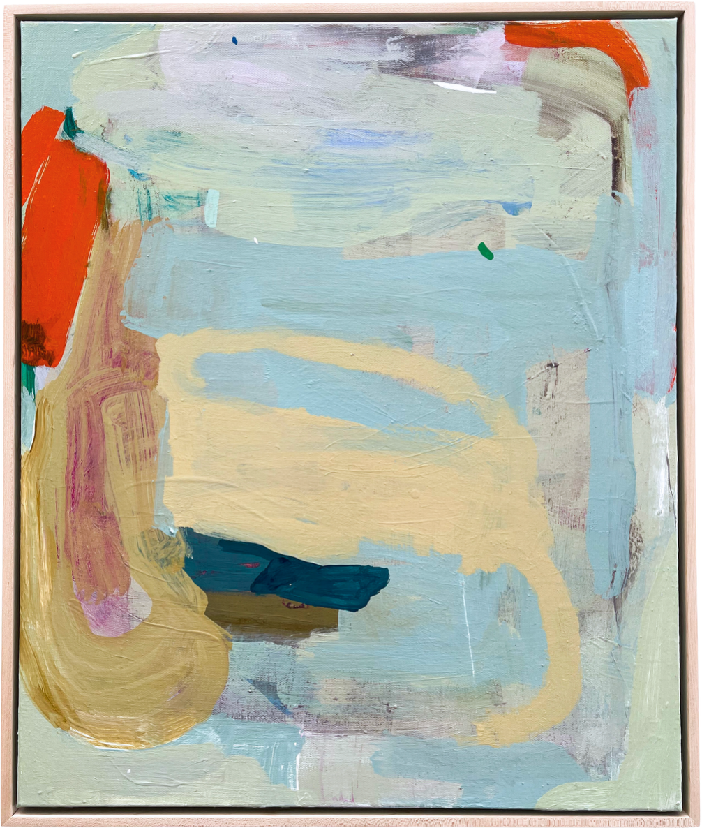
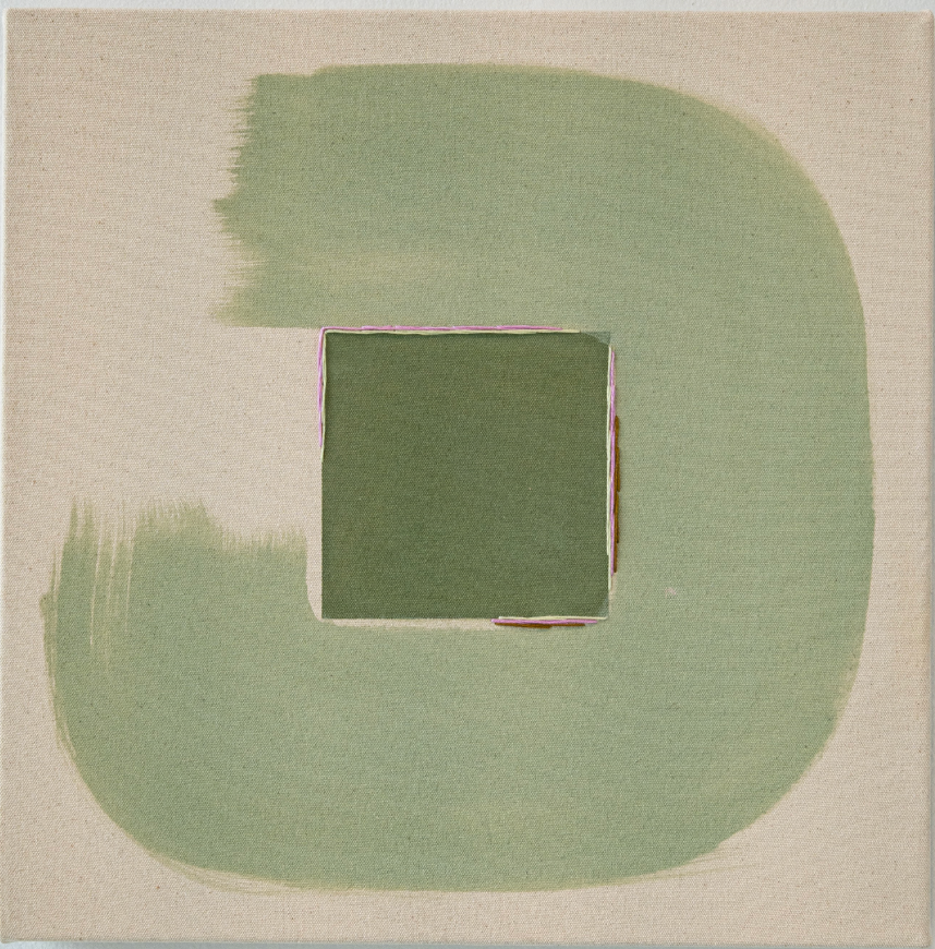
How we would pair Warm Eucalyptus with art:
Warm Eucalyptus is a shade designed to feel timeless—what Valspar calls a “multi-generational” color. It’s a hue that adapts beautifully to the way we live now: a hybrid mix of home, work, and entertainment all under one roof. What makes it so special is its ability to erase the line between indoors and outdoors. This soft, nature-inspired green carries the restorative qualities of the natural world right into our living spaces, creating an atmosphere that feels grounding, breathable, and endlessly versatile.
When it comes to pairing art with Warm Eucalyptus, the key is to lean into its purpose: blurring the boundaries between the built environment and nature. Artwork that emphasizes organic forms and natural textures enhances the color’s soothing effect while keeping a space elevated and personal. Think pieces that echo earthy tones—sandy neutrals, terracotta, warm creams—or artwork accented with materials like rattan, ceramics, or raw wood. Gilded gold details can also add a layer of sophistication, creating a beautiful balance between grounded and refined.
Glidden:
Warm Mahogany —
Glidden just dropped their 2026 Color of the Year, and I’ll say it loud and proud: GIVE ME THE WARM & JEWEL TONES! All year, we’ve been getting little hints of rich, cozy fall-inspired shades creeping into interior design schemes—and now it feels like the moment has arrived. Warm Mahogany wraps a home in a giant, welcoming hug the second you walk in the door.
What makes Warm Mahogany so special is its versatility. It’s a timeless shade that can shift with the mood of any room, transforming spaces into intimate, inviting gathering spots. There’s something undeniably authentic and personal about it—it feels safe, grounded, and elegant all at once. This color mirrors beautifully from natural, earthy tones like rust, brick red, or muted terracotta.
Color experts at Glidden recommend using Warm Mahogany on interior walls and trim in bedrooms, kitchens, dining rooms, and even home libraries. In the bedroom, for example, the depth of this shade makes a space feel cozy and intimate without ever being heavy or dark. Layer in soft linens, warm lighting, and accents in cream or blush, and you instantly balance the richness of the color with a touch of modern elegance.
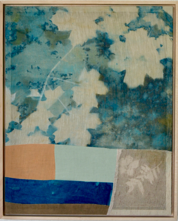
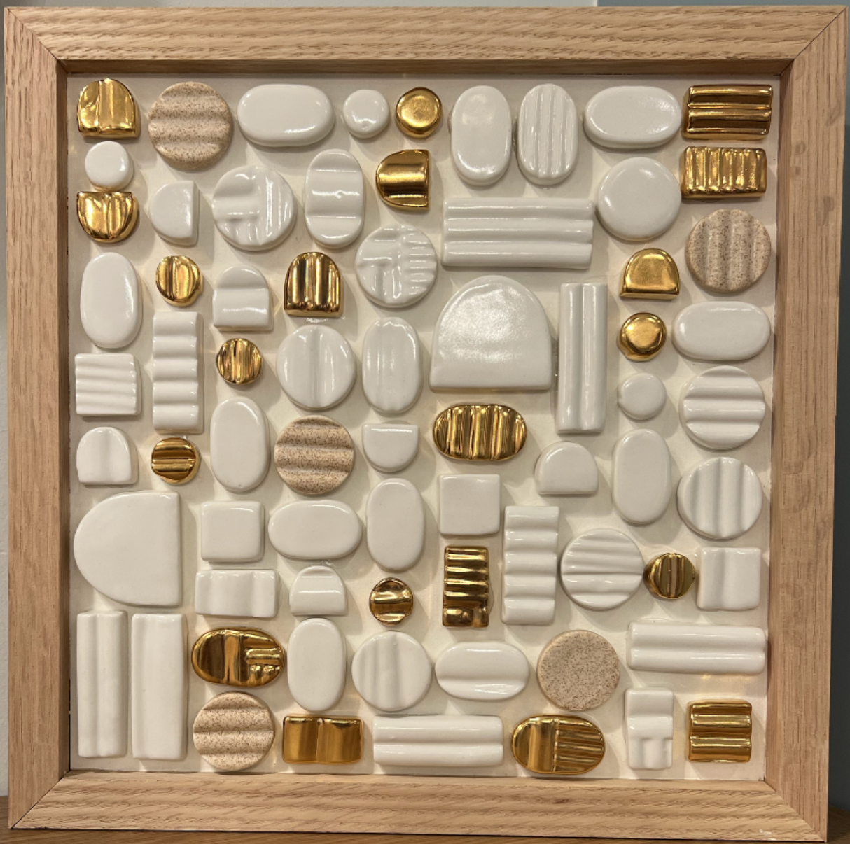
How we would pair Warm Mahogany with art:
Warm Mahogany is a deep, rich, and inviting shade that instantly gives a room personality and presence. When pairing it with art, the goal is to enhance that warmth while keeping the space thoughtfully curated and welcoming. Creams, soft neutrals, and natural wood tones are a perfect match—they balance the depth of the mahogany without dulling its vibrancy.
Navy blues or muted jewel tones are another fantastic pairing, adding contrast and sophistication while still feeling cozy and intentional. These combinations allow the color to adapt to any mood—whether the space is playful, intimate, or dramatic—it gives the artwork a backdrop that feels rich but not overpowering.
Beyond the color palette, think about texture and material when selecting your pieces. Wood frames, gilded antique accents, or ceramic elements can echo the natural, earthy undertones in Warm Mahogany, creating a sense of harmony throughout the room. No matter the type of artwork, the key is letting the art complement the color while allowing the personality of the space—and everyone who inhabits it—to shine through.
Behr:
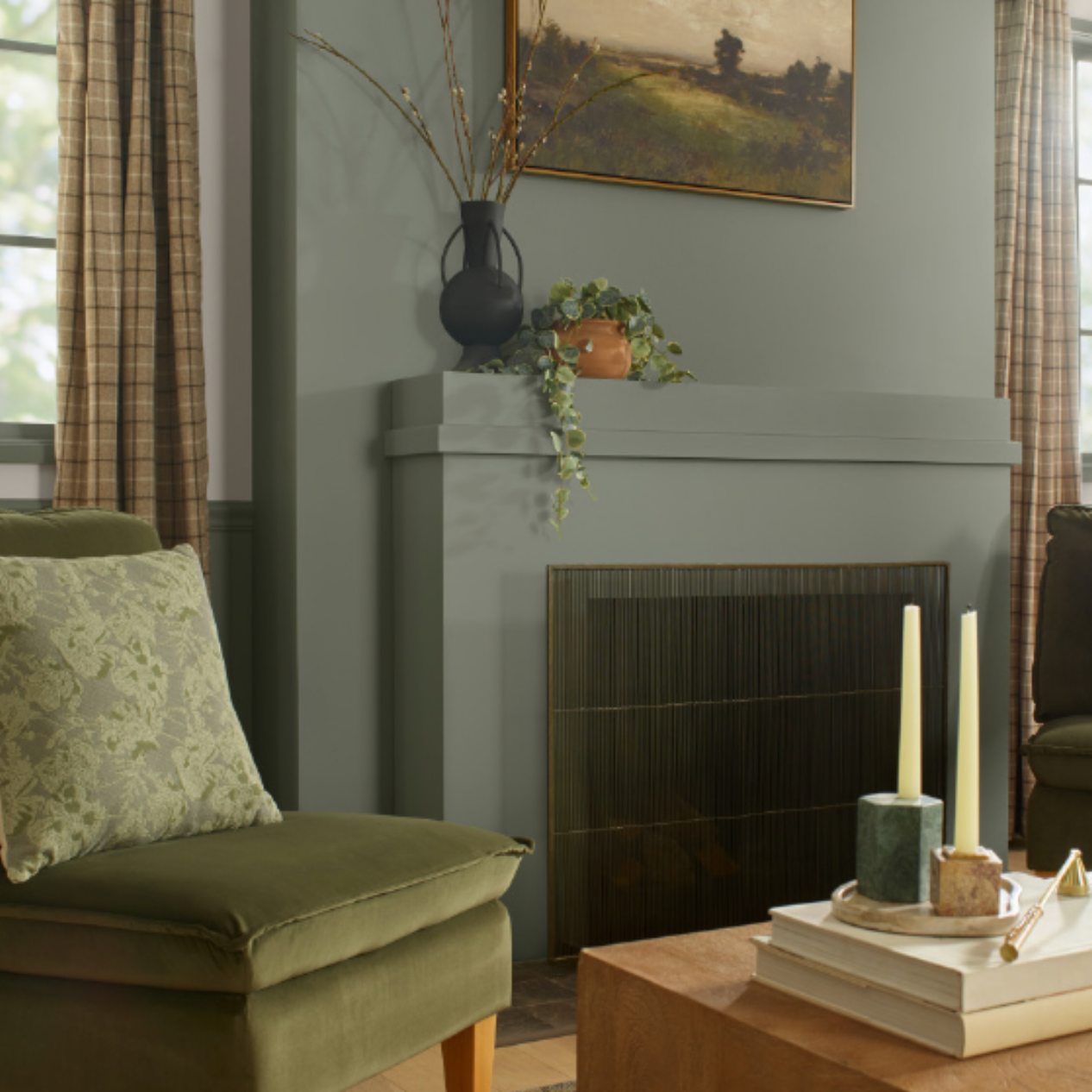
Hidden Gem —
Behr’s 2026 Color of the Year, Hidden Gem, is quietly confident—and it’s a shade that has a way of transforming a space without ever shouting for attention. Think smoky jade: mysterious, sophisticated, and grounded, yet full of life and depth. Walking into a room painted in Hidden Gem feels like stepping into a space that’s both calming and captivating—a color that invites you to linger.
Hidden Gem is incredibly versatile. For interiors, a flat finish works beautifully on walls in living rooms, dining rooms, or even ceilings, creating a soft, enveloping backdrop. Satin finishes are perfect for furniture, doors, or baseboards, where the silky sheen adds just the right touch of elegance. The color has a rare ability to infuse spaces with richness and depth while still feeling approachable, acting almost like a neutral that never gets boring.
As Erika Woelfel, Behr’s VP of Color and Creative Services, puts it: “Now more than ever, there’s a growing appetite for colors that challenge convention and bring an unexpected sense of wonder to everyday spaces. Hidden Gem captures that spirit in both name and color—its depth and refinement meets the desire for colors that are eternally stunning and stylish.”
One of the best things about Hidden Gem? Its adaptability. Whether you’re committing to a full-scale project like painting kitchen cabinets or just refreshing your front door, this shade works beautifully in any application. It’s a color that feels intentional, modern, and undeniably timeless—a shade that quietly elevates every corner it touches.
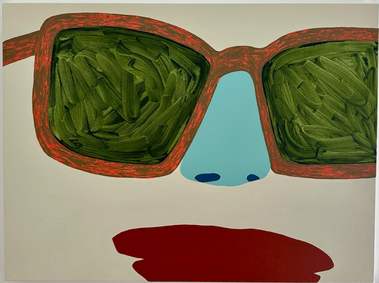
How we would pair Hidden Gem with art:
Hidden Gem is a color that’s full of depth and quiet personality, which makes the perfect backdrop for artwork that makes it easy to any home-owner inviting art into their space. To keep the room feeling balanced and inviting, we love pairing it with creams, soft neutrals, and shades of blue that add contrast while keeping things grounded.
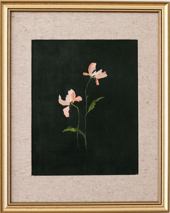
Accent shades of green in a painting work beautifully alongside Hidden Gem, echoing its natural, jade-like quality and creating a cohesive, layered look. Whether it’s abstract pieces, botanical-inspired work, or even more contemporary prints, these tones help bring the art—and the room—to life, giving every corner a sense of harmony and thoughtful style.
Hidden Gem has this rare ability to make both bold and subtle pieces shine. By leaning into complementary colors like creams, blues, and natural greens, the space feels curated, warm, and endlessly versatile—just like the color itself.
So, what do you think Pantone’s Color of the Year will be for 2026? Will it be a fresh shade of green, a calming neutral, or a bold, deep red? It’s fun to imagine the possibilities—and how each color might change the feeling of a space.
Whether you’re drawn to earthy tones, jewel-inspired hues, or something in between, it’s amazing how the right color paired with art can completely transform a room. Every wall is a chance to create mood, personality, and a sense of home.
With our art installation service we offer here at Liz Lidgett Gallery + Design, we help you decide the beauty of your walls and the artwork that matches the backdrop. Utilize our interior design services with our Director of Interior Design—Hannah Jacobus—to transform your space with design consultations of furntiture, decor, art choices, wall and window treatments.