
How to Pair Interior Color Schemes with Art
After updating our walls to our newest show, Wild and Precious, we couldn’t help but notice all of the perfect color swatches throughout that would pair so well in interior homes.
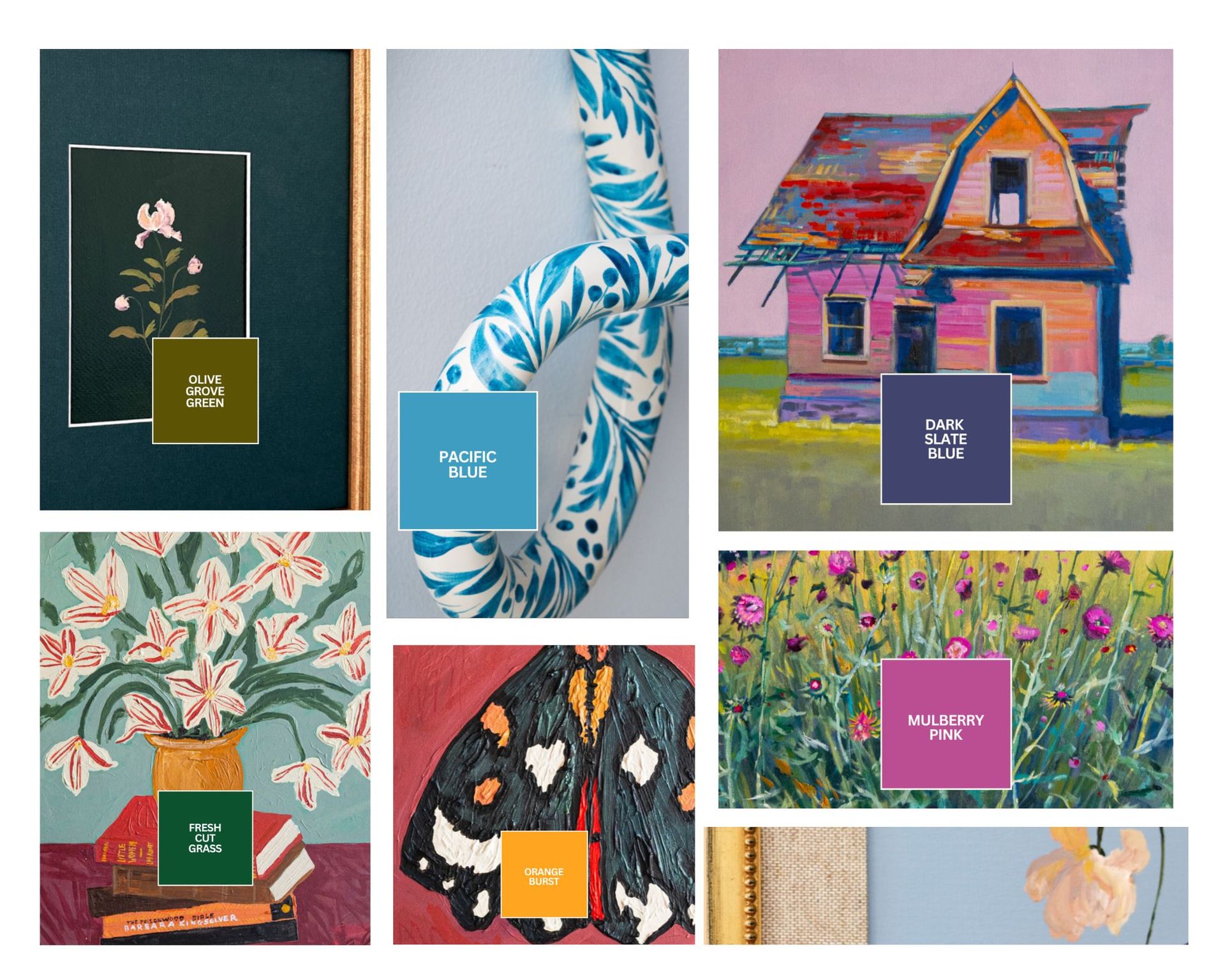
When it comes to designing a home you love, the relationship between your wall color, decor, and artwork is the key to creating a sense of harmony and the targeted mood. Art isn’t just an accessory—it guides your entire color scheme throughout. Our newest show has us thinking about just that: how the colors in a piece of art can influence and transform a room.
Here are a few tips for pairing your interior color schemes with the artwork you love:
1. Pull Colors Directly from the Art
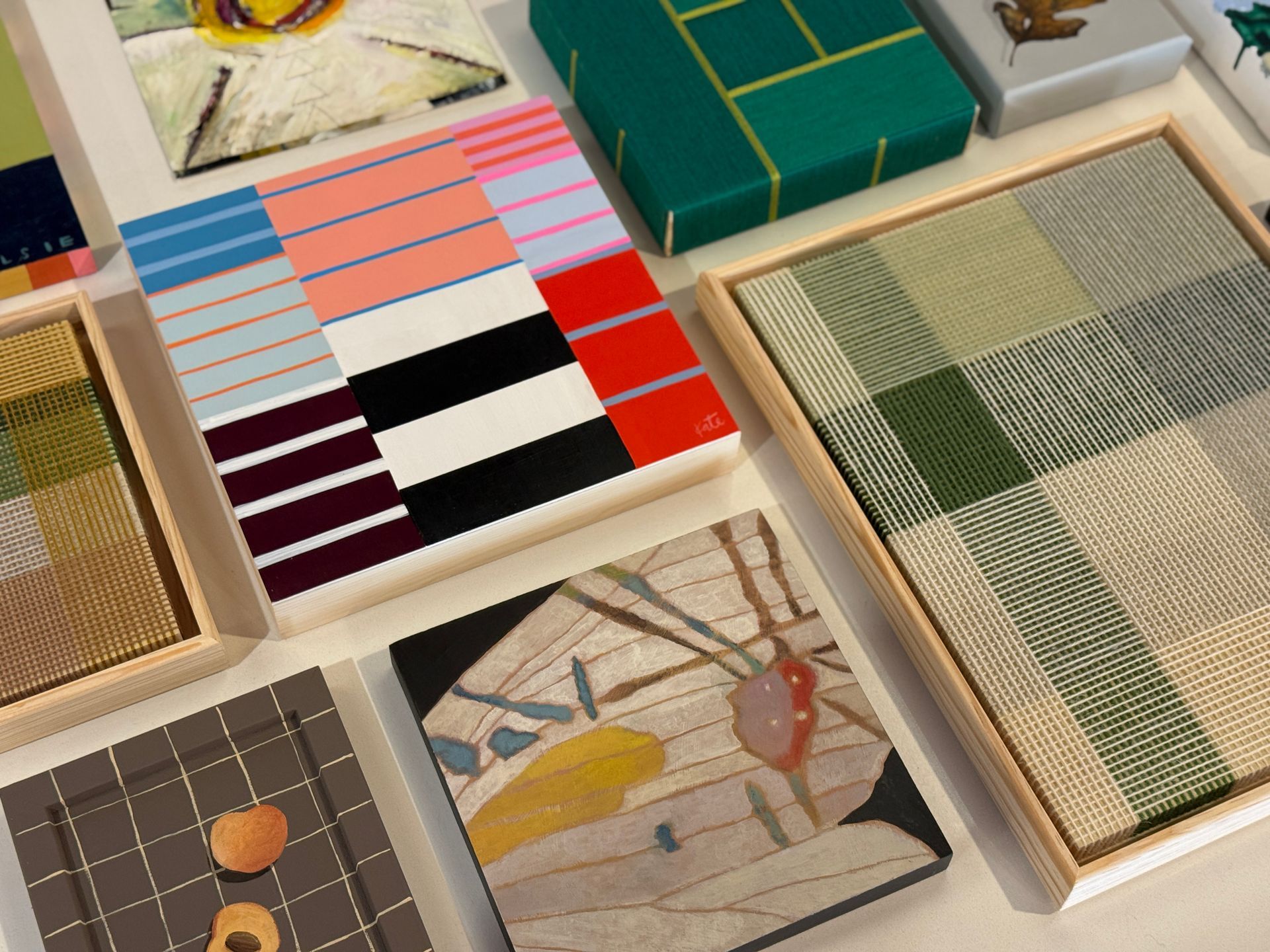
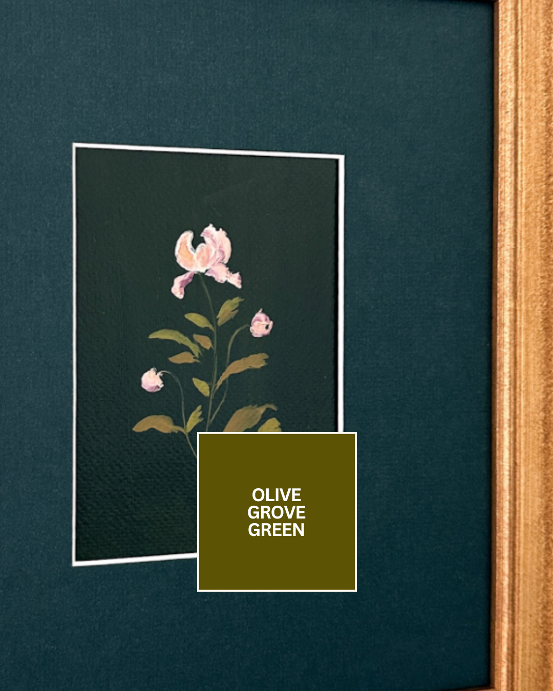
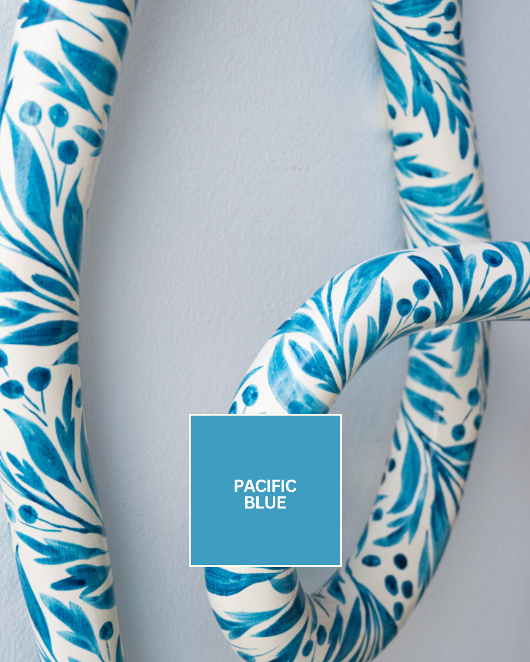
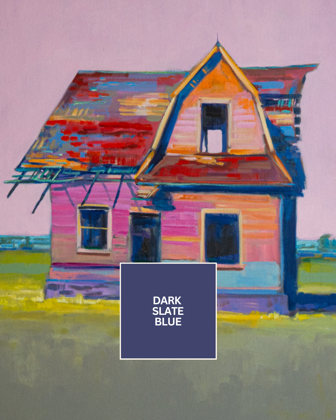
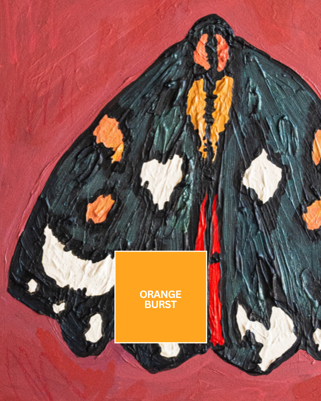
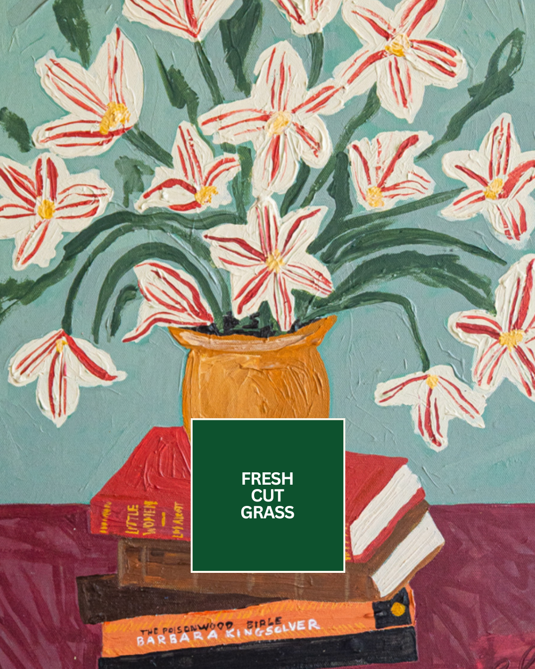
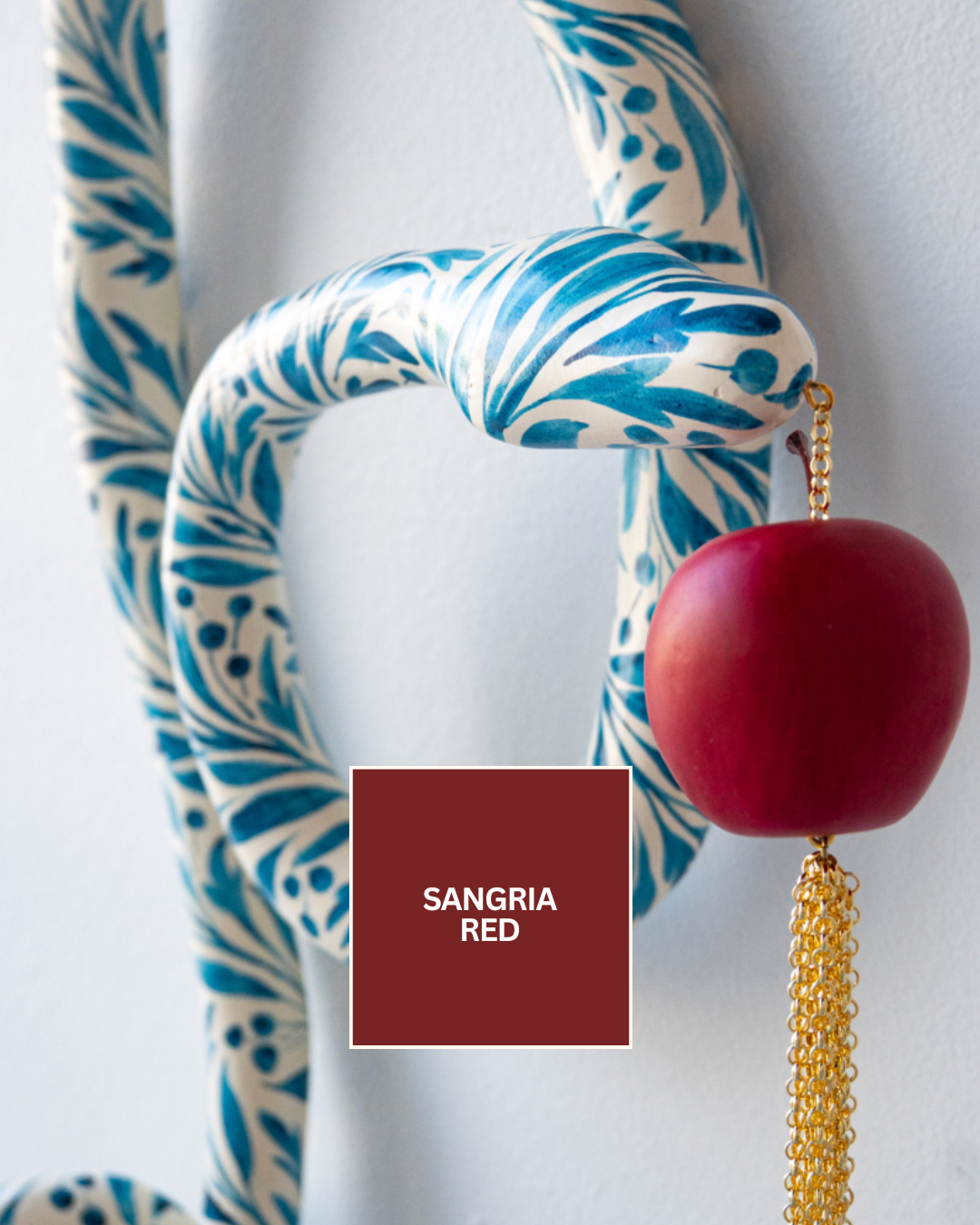
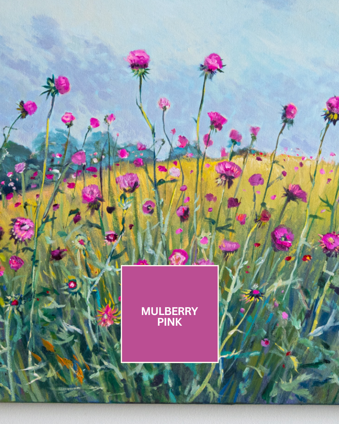
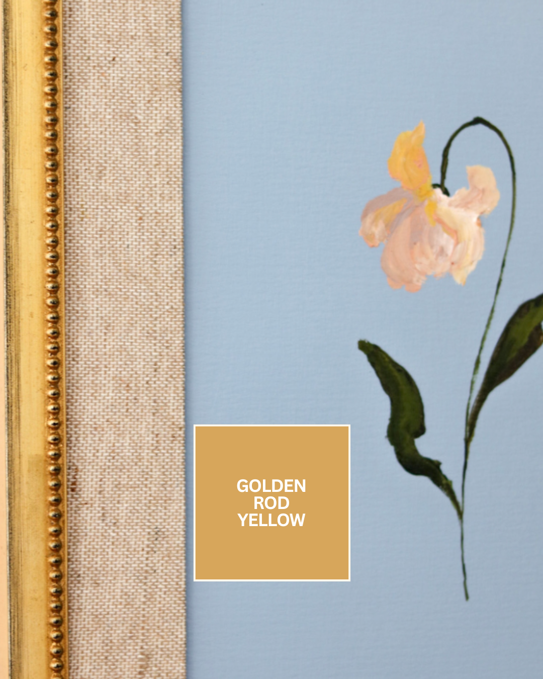
When designing a space around a piece of art, the first step is to truly take a moment and study the artwork itself. Look closely—what color jumps out at you right away? This is usually the dominant or main color. Then, notice the smaller details and supporting hues. These may be accent colors that add depth and interest to the piece. Finally, take in the subtler tones that make up the background or negative space, as these often provide balance and help the artwork feel grounded.
Once you’ve identified these colors, think about how they might translate into your interior design. A bold main color could be echoed on an accent wall, a sofa, or a statement rug. Accent colors often shine in smaller doses—consider weaving them into throw pillows, vases, or artwork frames. The background tones are just as important; they can set the mood of the entire room and may work beautifully for larger surfaces like wall paint, curtains, or flooring.
2. Be Strategic with Bold Colors
When decorating with art, it’s important to think about how color plays a role in the overall atmosphere of a space. If your artwork has a strong, dominant color, you might be tempted to carry that shade onto the walls to create cohesion. However, painting an entire wall in the same bold color can often overwhelm the piece, causing the artwork to lose its impact rather than stand out. Instead of going all-in with paint, there are more subtle ways to weave that color into your design that feel intentional yet balanced.
One approach is to consider wallpaper. Choosing a wallpaper that incorporates the dominant color allows you to bring the shade into the room in a softer, more nuanced way. The texture, patterns, and small breaks of the wallpaper keep the space feeling more dynamic and visually interesting without overshadowing the art. Similarly, framing is another effective option. By selecting a frame that picks up on the dominant hue, you create a link between the art and the room’s design without letting the color take over. The frame becomes a thoughtful detail that ties everything together, offering just enough repetition of color to feel harmonious.
Ultimately, the goal is balance. You want your art to shine as the focal point while ensuring the surrounding design elements support it rather than compete with it. Through use of wallpaper, frames, and subtle accents, you can highlight a dominant color in your artwork while maintaining a cohesive and inviting environment.
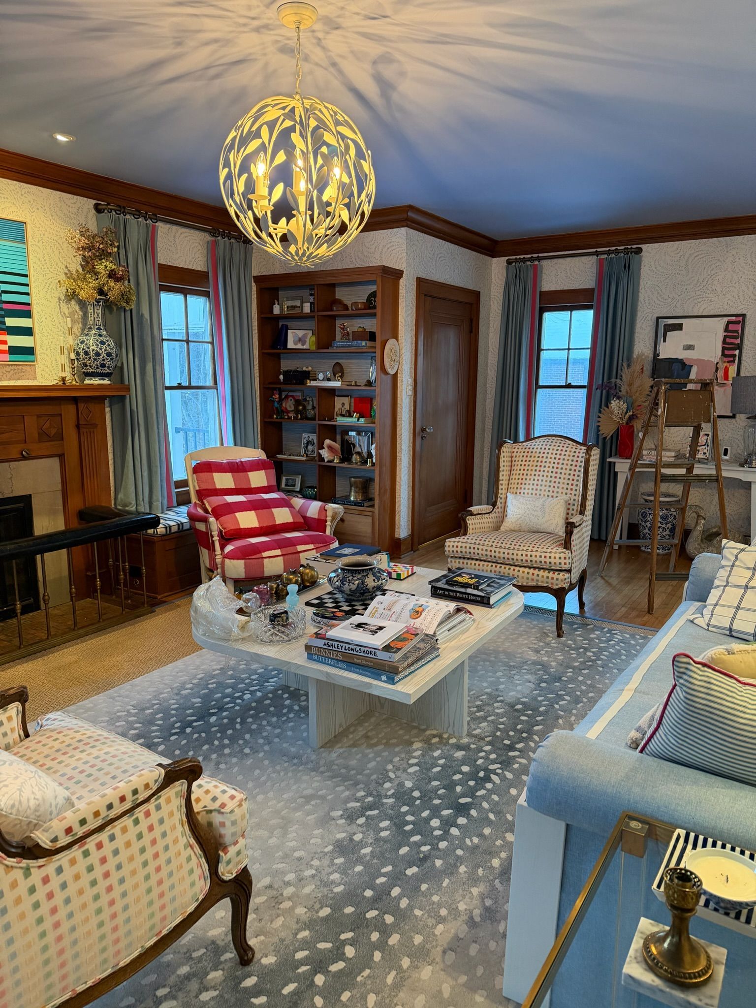
3. Balance with Complementary Tones
When it comes to designing a room that feels inviting, balance is key, and color plays one of the most powerful roles in achieving it. Color harmony isn’t just about matching shades perfectly, it’s about creating the relationships between tones so that a space feels alive rather than flat. If a room leans heavily into a single color (like a lush green living room or an all-blue bedroom), it can quickly become overwhelming or monotonous if not balanced with something to break it up.
This is where complementary colors come in. On the color wheel, complementary shades sit opposite each other (think blue and orange, red and green, yellow and purple). When paired together, they naturally enhance one another, creating a sense of vibrancy and energy that neither color could do on its own. By layering complementary tones through your art or décor, you introduce a space that feels more than just one-dimensional. This creates a push and pull that keeps the eye moving around the room.
The trick is not to overdo it. Too much of a complementary color can feel jarring, but sprinkling it in through framed artwork, accent pillows, rugs, or even floral arrangements allows you to achieve harmony without creating chaos. The result is a space that feels layered, balanced, and full of personality—where your art isn’t just a decoration but a key player in the overall design story.
4. Factor in Lighting and Mood
One of the most overlooked elements in designing with color and artwork is lighting. Yet, it plays an enormous role in how colors are perceived and, ultimately, how a space feels. The same painting can look completely different depending on whether it’s lit by natural sunlight streaming through large windows, warm lamplight in the evening, or a spotlight designed specifically for art. That’s why it’s important to think about not only the colors in your artwork, but also the kind of feeling you want your space to achieve.
Bright, abundant light tends to make colors appear more vivid and bold. A sunny living room, for example, will amplify the cheerfulness of bold yellows, blues, or pinks, making the artwork feel lively and fresh. On the other hand, dim or diffused lighting has a softening effect. Rather than expecting the artwork to “pop,” it may instead contribute to a moody, intimate ambiance. A softly lit corner with a muted landscape painting or abstract piece in darker tones can encourage relaxation and reflection, perfect for bedrooms, dining rooms, or cozy nooks.
It’s also worth noting that artificial light can change the way colors are perceived. Warm bulbs will enhance reds, oranges, and yellows, creating a golden glow, while cooler-toned lighting brings out blues and greens. Playing with this balance can help you highlight certain aspects of your artwork or create contrast with your wall and décor choices.
The key takeaway: by factoring in lighting as part of your design plan, you ensure that your artwork doesn’t just decorate your space but actively contributes to the emotional experience of being in it.
5. Use White Walls as a Blank Canvas
White walls are often seen as a blank canvas, and that’s exactly what makes them such a powerful design choice. They provide a clean backdrop that allows your artwork to stand out without distraction. But while white walls showcase bold colors beautifully, they can also leave artwork feeling a little disconnected if the rest of the room doesn’t echo the tones or energy of the piece. The key is to make sure your art isn’t “floating” on the wall, but instead feels integrated into the overall design of the space.
One of the simplest ways to do this is by pulling colors from your artwork and incorporating them into nearby décor or furnishings. For example, if a painting has rich cobalt blues, consider adding a throw pillow, area rug, or accent chair in a similar shade. If a piece is filled with warm earth tones, you might bring in ceramics, wooden finishes, or textured textiles that echo those colors. These subtle connections create a conversation between the artwork and the room, making the space feel cohesive rather than piecemeal.
The beauty of neutral walls is their versatility. A crisp white wall allows you to rotate artwork seasonally or swap pieces whenever you feel like refreshing the room, without having to redo your entire color scheme. It also gives you the freedom to layer textures—linen curtains, woven baskets, brass accents—that don’t compete with the art but still contribute warmth and depth.
Lighting also becomes especially important with white walls. Natural light can make both the walls and the art look airy and expansive, while spotlighting or picture lights can give your artwork extra emphasis and presence. Think of your white walls not as an absence of color, but as a stage where your artwork takes center spotlight, supported by décor that ties the performance together.
Every time we rehang a show in the gallery, we’re reminded how transformative color can be. A single piece of art can inspire a whole palette, shift the energy of a room, and even change how we feel in the space. Whether you’re planning your next paint project or just moving around your furniture, let your art lead the way.
Do you have a space—or several spaces—that don’t feel like you? Or rooms that sit unused because they just don’t work for your lifestyle or spark emotion? At Liz Lidgett Gallery + Design, we specialize in creating spaces that not only function flawlessly but also reflect your personality, passion, and artful taste.
Whether it’s reimagining a cheerful breakfast nook or redesigning an entire home, we’re here to help you have a home that truly brings you happiness. Let’s work together to transform your environment into a joyful, personalized haven.